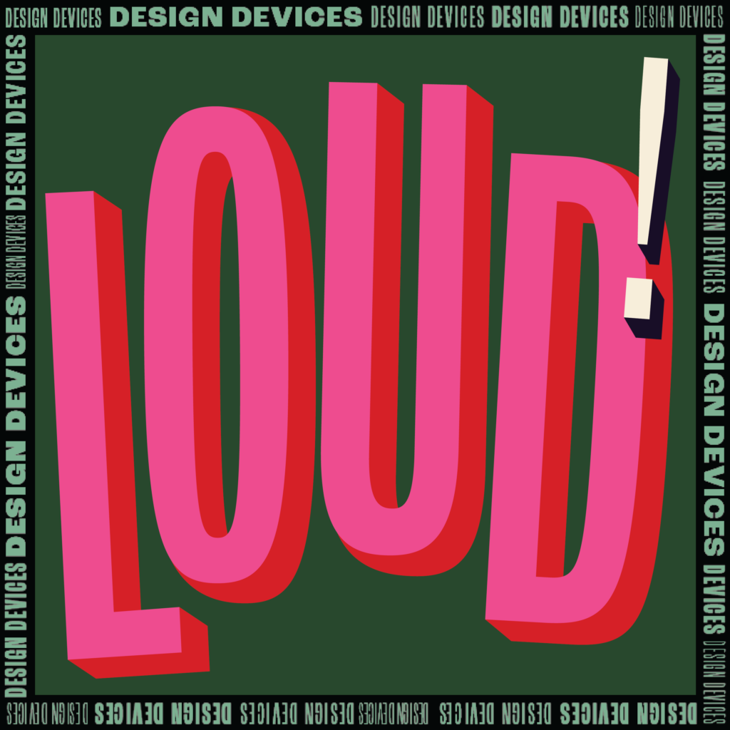
Publishers love to see the volume turned way UP on titles until they’re SHOUTING with demanding, bold typography. The digital thumbnail is the new storefront window, and as such, publishers often ask designers to ditch graphics in favor of colossal typography. This “trend” is nothing new and it’s probably not going anywhere soon.
It’s not easy to create an all-type cover that is ALSO interesting, distinct, and well-designed. Just filling the rectangular page with text is not enough. A good designer does this while making sure that not every cover with LOUD typography looks the same.
Here is a BIG collection of all-type covers, where typography reigns supreme and letters themselves have become the art. Explore the tag “loud text” for even more covers like these.
*If you’re able to provide any missing design credits, please write us at ineedabookcover.site@gmail.com.
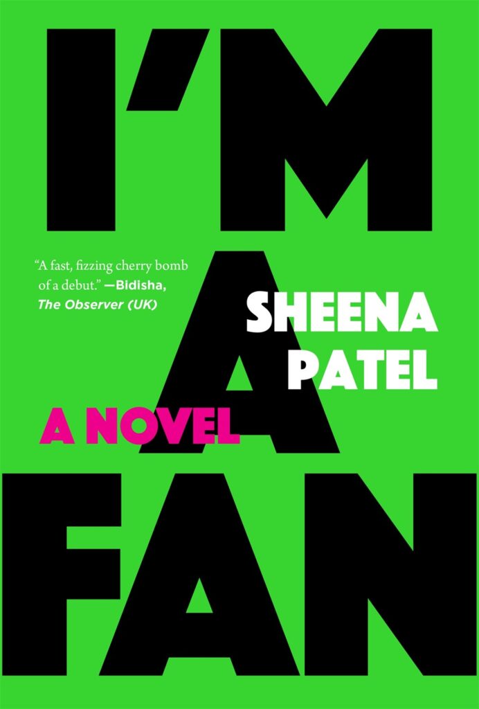
“I’m A Fan” by Sheena Patel
Designer: Carlos Esparza
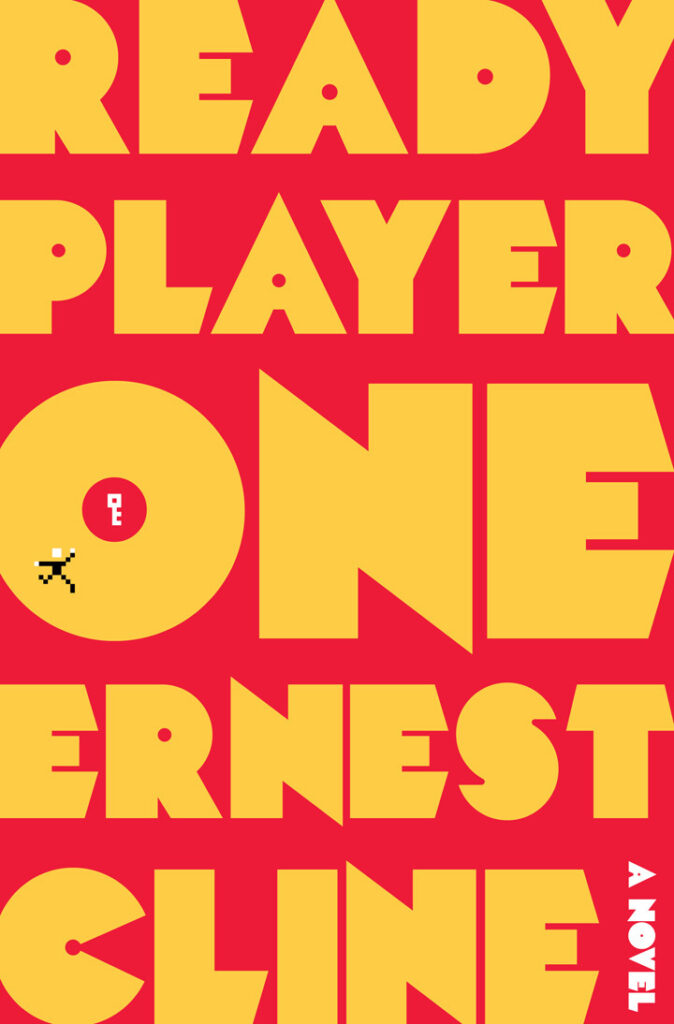
“Ready Player One” by Ernest Cline
Designer: Chris Brand
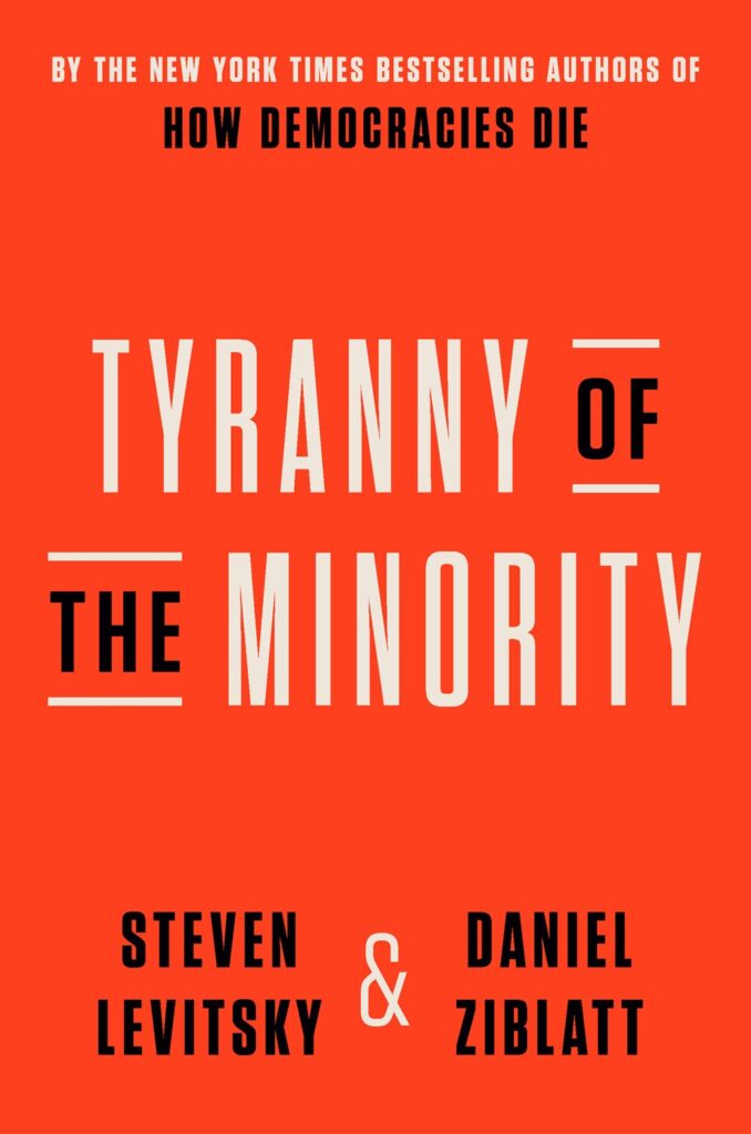
“Tyranny of the Minority” by Steven Levitsky & Daniel Ziblatt
“The Trade Trap” by Mathias Dopfner
“Countdown to Socialism” by Devin Nunes
Publisher: Encounter Books
“The Dawn of Everything” by David Graeber and David Wengrow
Designer: Thomas Colligan
“Sweet & Low” by Nick White
Designer: Jason Booher

“Euro Whiteness” by Hans Kundnani
Publisher: Hurst Publishers
“Against Decolonisation” by Olufemi Taiwo
Publisher: Hurst Publishers
“How To Argue With A Racist” by Adam Rutherford
Publisher: The Experiment
“Unreasonable Hospitality” by Qill Guidara
Publisher: Optimism Press
“The Last Samurai” by Helen De Witt

“What Is Anti-Racism” by Arun Kundnani
Publisher: Verso Books
“Free Speech” by Andrew Doyle
Designer: Steve Leard

“The End of Policing” by Alex S. Vitale
Publisher: Verso Books
“This Is Not Normal” by William Davies
Designer: Steve Leard
“On Animals” by Susan Orlean
Designer: Alison Forner
“Democracy’s Data” by Dan Bouk
“Crazy Sorrow” by Vince Passaro
Publisher: Simon & Schuster
“Bleed” by Tracey Lindeman
“Of Boys And Men” by Richard V. Reeves
Publisher: Swift Press

“Why Men?” by Nancy Lindisfarne & Jonathan Neale
Publisher: Hurst Publishers

“A False Report” by T. Christian Miller & Ken Armstrong
Designer: Chris Brand

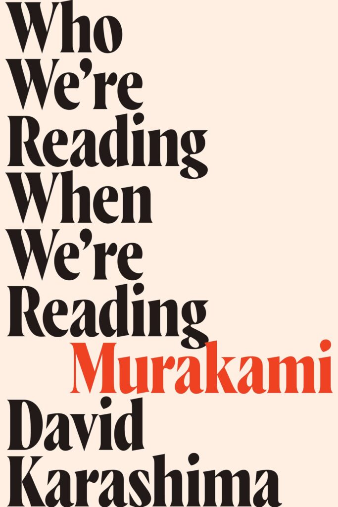
“Who We’re Reading When We’re Reading Murakami” by David Karashima
“The Status Game” by Will Storr
Designer: Steve Leard
“How Democracies Die” by Steven Levitsky & Daniel Ziblatt
Designer: Christopher Brand
“Good Americans”
“Headscarves And Hymens” by Mona Eltahawy
Designer: Alex Merto
“Dick Cheney Shot Me In The Face” by Timothy O’Leary
“Social Justice Fallacies” by Thomas Sowell

“Mediated Death” by Johanna Sumiala
Designer: Steve Leard
“What White People Can Do Next” by Emma Dabiri
“Why Politics Fails” by Ben Ansell
Designer: Pete Garceau
“The Last Love Poem I Will Ever Write” by Gregory Orr
Publisher: W. W. Norton
“Why We’re Polarized” by Ezra Klein
Designer: Alison Forner
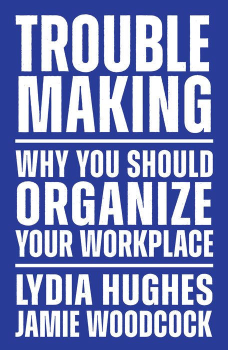
“Trouble Making” by Lydia Hughes & Jamie Woodcock
Publisher: Verso Books
“100% Democracy” by E.J. Dionne Jr. & Miles Rapoport
Designer: Ben Denzer
“What Went Wrong With Brexit” by Peter Foster
Publisher: Canongate Books


