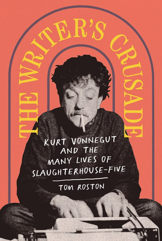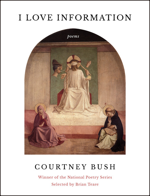
The Arch has been used in architecture for thousands of years, but for whatever reason, it became a popular shape featured on book covers in recent years.
The shape of an arch creates a sense of movement and transition. They are often used to mark the boundary between two spaces, and the curved shape creates a visual cue that invites people to pass through it. To me, they feel like portals. This can give the impression of moving from one place to another, or of entering into a new space or realm. An arch, when viewed on flat, 2D paper, has more movement than the shape of a “regular” rectangular doorway made from two 90º angles.
Arches can also add a sense of grandeur or importance. In architecture, they are often found in grand buildings and structures, such as churches, castles, and temples. As such, the use of an arch can add a sense of ceremony or significance to a book cover.
Here are 13 covers from recent years that use the shape of an arch as a defining feature. Explore the tag “arches” to see even more covers that use this popular design element.
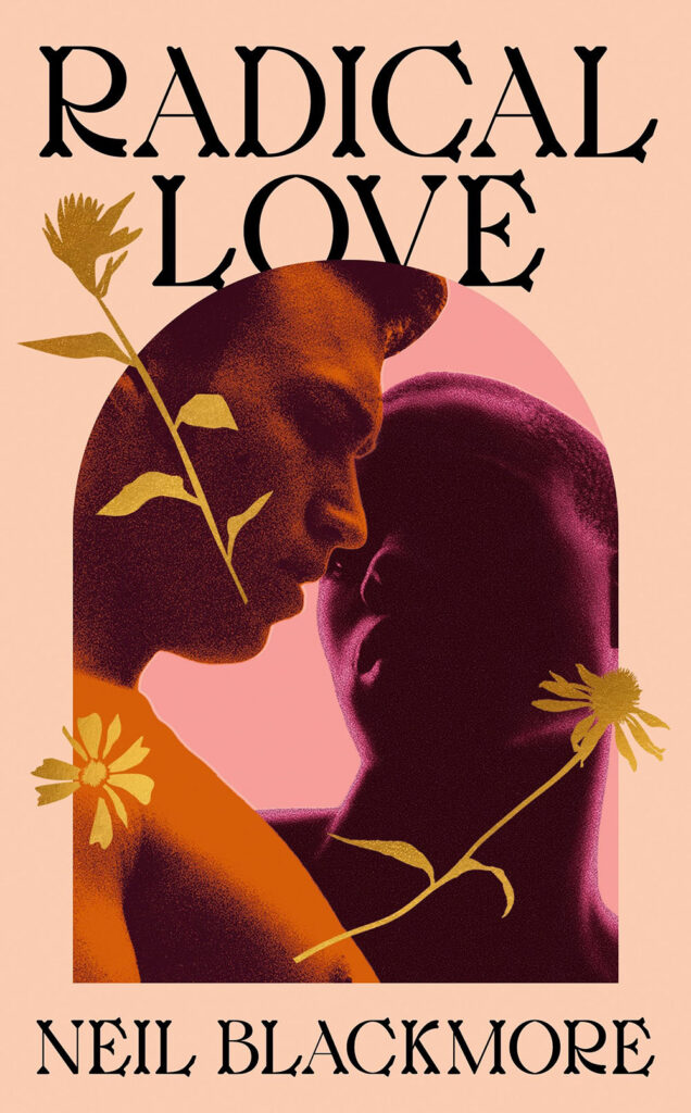
Radical Love by Neil Blackmore
Designed by Henry Petrides
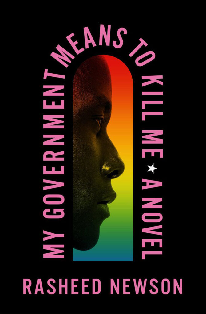
My Government Means To Kill Me by Rasheed Newson
Designed by Keith Hayes
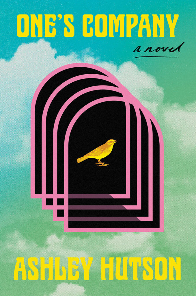
One’s Company by Ashley Hutson
Designed by Joanne O’Neil
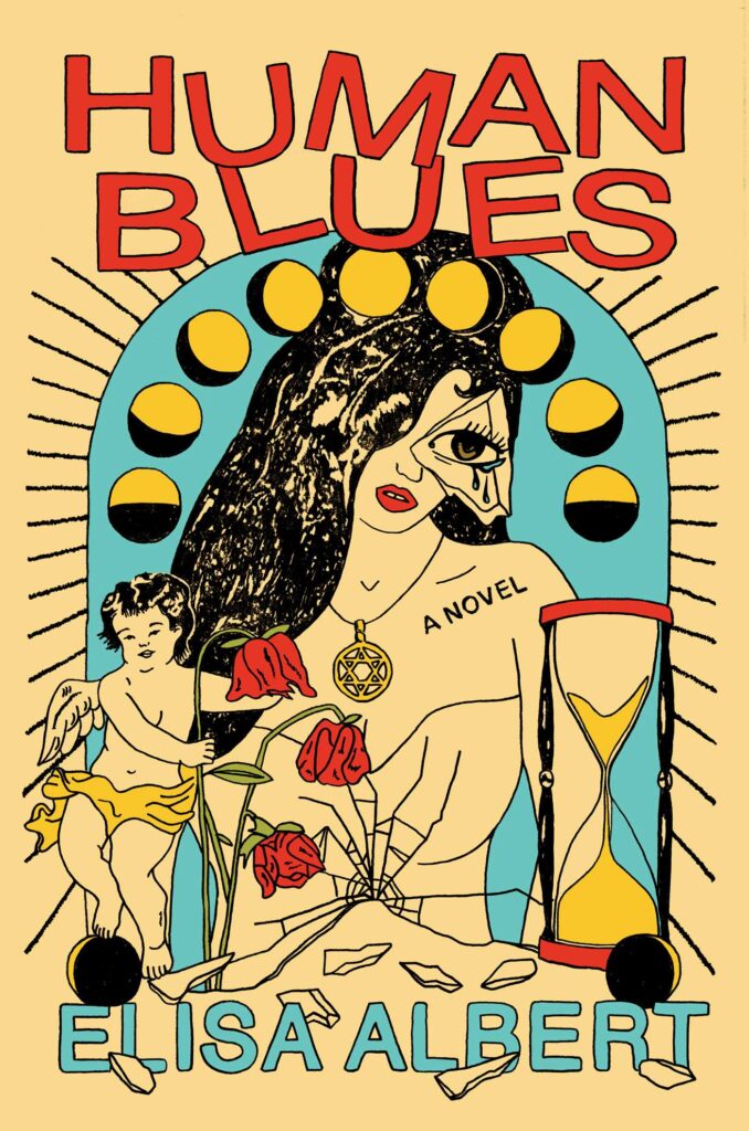
Human Blues by Elisa Albert
Designed by Alison Forner
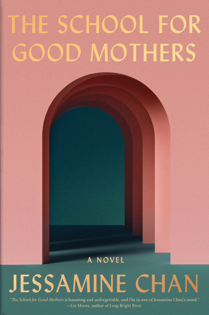
The School For Good Mothers by Jessamine Chan
Trust by Hernan Diaz
Designed by Keith Hayes

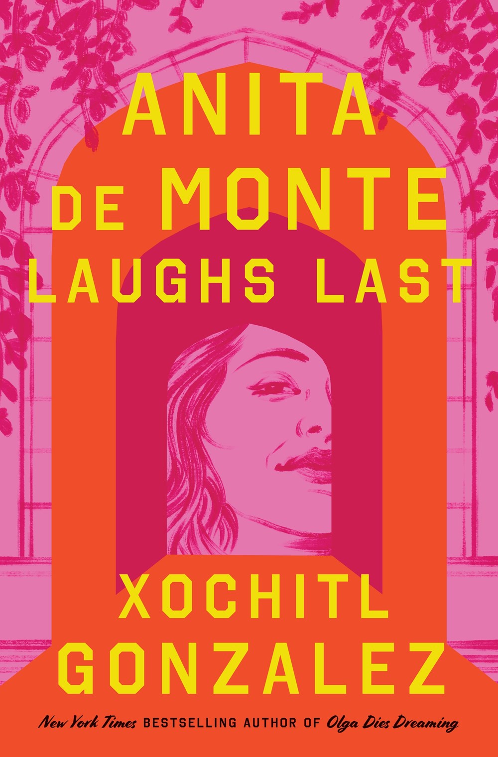
Anita de Monte Laughs Last by Xochitl Gonzalez
Eleutheria by Allegra Hyde
Designed by Maddie Partner

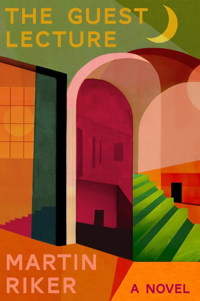
The Guest Lecture by Martin Riker
Designed by Kelly Winton
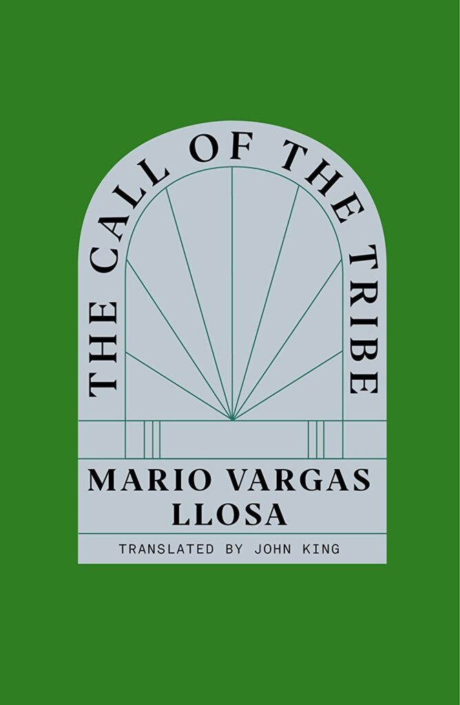
The Call of The Tribe by Mario Vargas Llosa
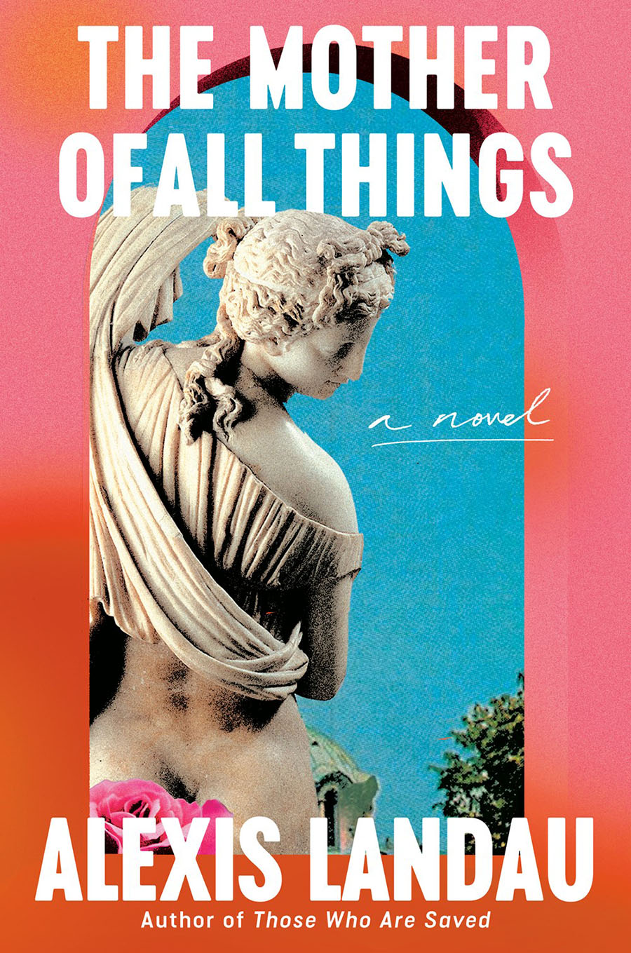
The Mother of All Things by Alexis Landau
Designed by Arsh Raziuddin
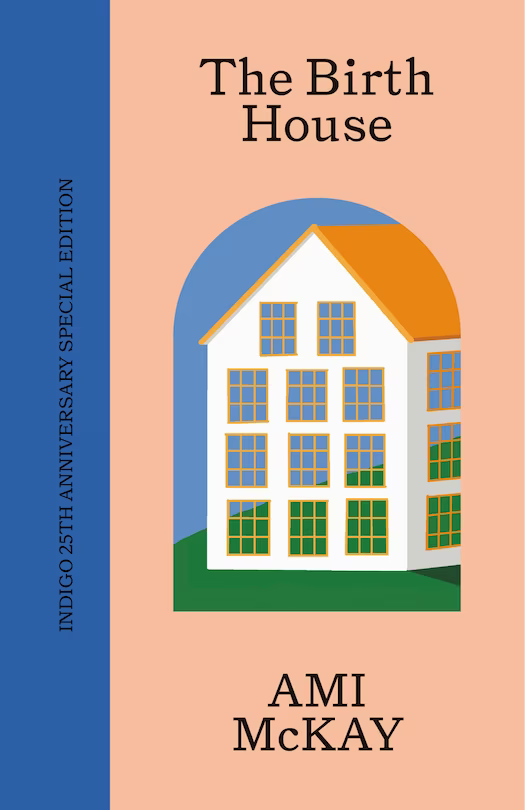
The Birth House by Ami McKay
Designed by Wedge
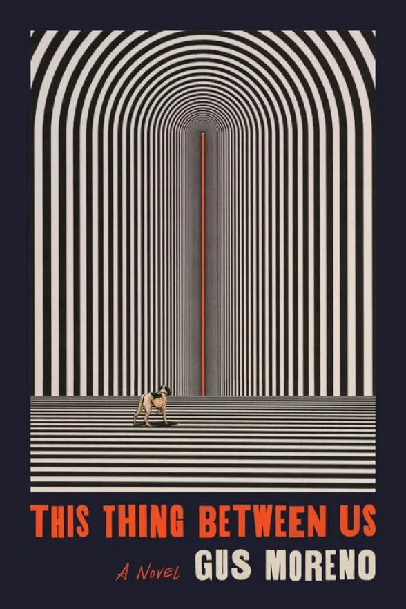
This Thing Between Us by Gus Moreno
Bonus: More examples of arches in book cover design