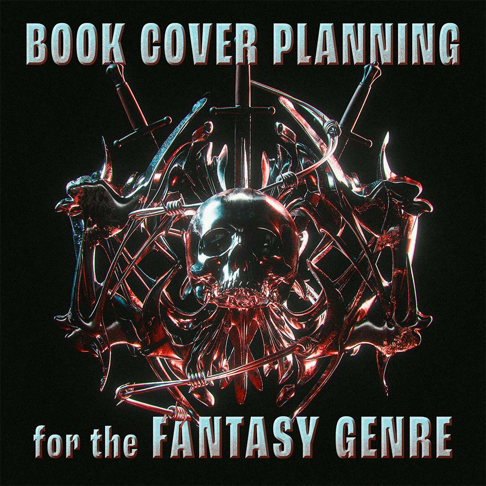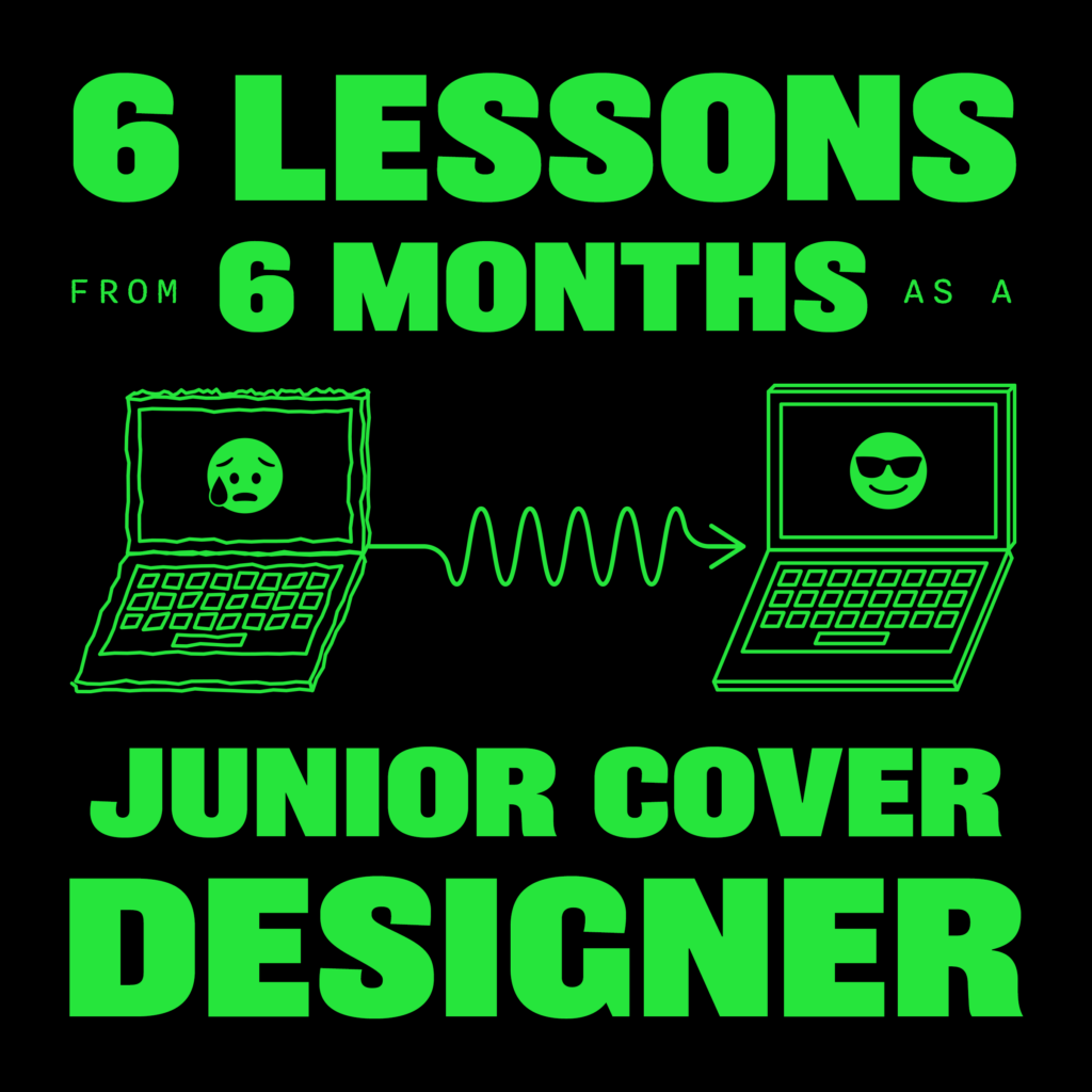
Hi! I’m Aarushi, a recent graphic design graduate from the Savannah College of Art and Design. Six months ago, I joined the Random House cover art department as a junior designer. As I celebrate this milestone, I’m excited to share six broad lessons (in no particular order) that have shaped my design practice since stepping into this role.
When I tell people that I’m a designer in the publishing industry, the question I’m asked most often is whether I need to read all the manuscripts for the covers I work on.
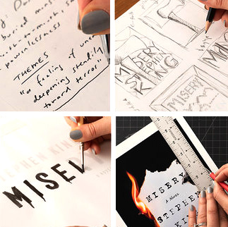
“Don’t skip to the end” might be a little overzealous (and I’ve done my fair share of skimming manuscripts since joining up, pesky deadlines to blame) but when a manuscript or excerpt has been available to me, I’ve always tried to read as much of it as possible, learning along the way how to dissect the texts with a critical and analytical approach. When I read a manuscript for work, my primary goal is to find connections between different narrative elements in order to come up with a strong concept for the cover. I’m still developing my process, but I’ve condensed it into two main steps.
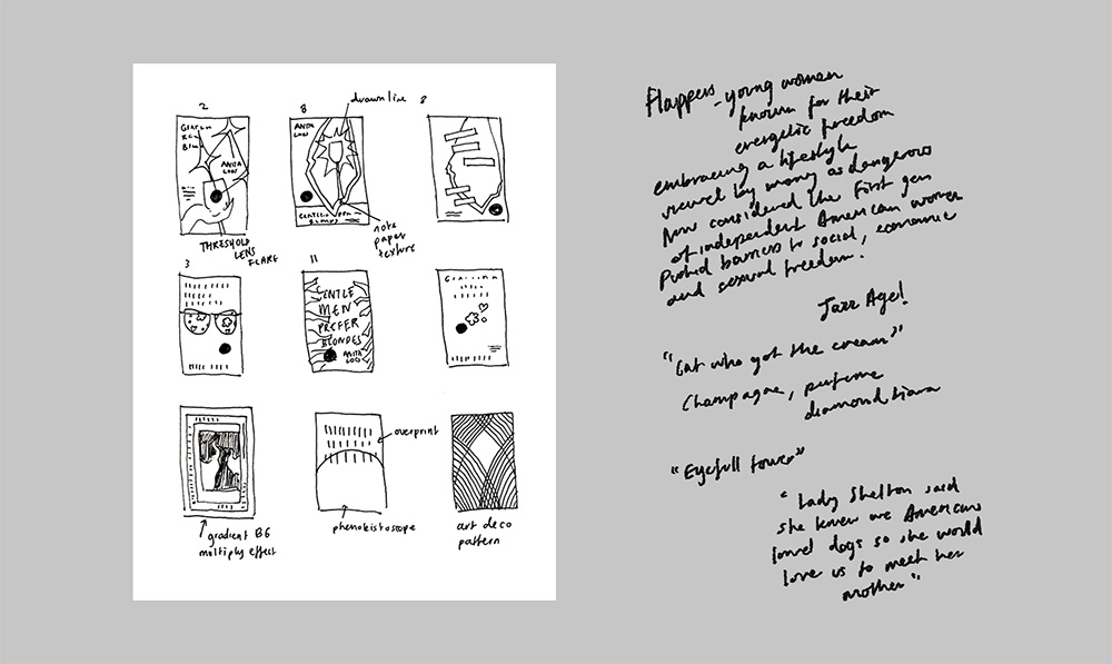
The first step is to note down as many significant visual details as possible and to take notes about the book’s main themes and character arcs. I’m aided here by the cover brief, a document assembled by the editor and author that outlines some of this information along with ideas for the cover direction and style.
The second step involves searching for opportunities to juxtapose, fuse, or replace elements with one another. What would happen if I combined the visual characteristics of a piano and a hurricane or a scope with a heart? How would the resulting image convey the message(s) of this book? Such combinations can lead to those types of clever covers that feature a second read or visual metaphor. During this second stage, the explorations often evolve through sketches.
In the early days, inspired by the status-quo-defying covers that initially drew me to this field, I would sometimes get very ”experimental” with my designs, renouncing the requirements laid out in my cover briefs and casting aside all genre conventions.
Unsurprisingly, those designs did not clearly represent the book’s specific tone or content. The publishing teams would then have to gently nudge me back toward more genre-focused styles from the briefs in order to ensure that the covers attracted their intended audience. After a few such instances, embarrassed by my repeated floundering, I started following the briefs to the letter, completely emulating genre conventions in the hopes of streamlining my cover approvals.
After discussing this experience with my art directors and colleagues, they encouraged me to approach my design process differently. They emphasized the importance of adhering to the cover brief and creating genre-standard designs, but also suggested not to restrict myself too much. My art directors shared that it’s important to show the publishing team at least some unorthodox cover ideas to demonstrate that every possibility has been considered. Perhaps the team will feel moved to approve an unexpected cover, or, upon seeing out-of-the-box designs, will decide that the book needs something more fitting for the genre.
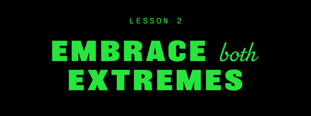
I’m grateful for my art department’s direction and I’ve now adopted a much more balanced strategy for every cover I work on. I try to create a mix of traditional and unconventional designs, embracing both extremes and everything in between.
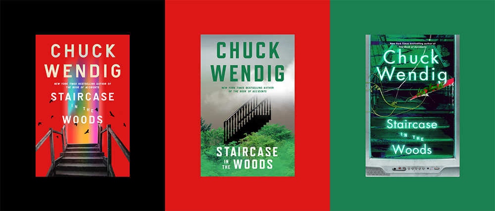
I had the opportunity to throw some of my designs into the mix for Staircase in the Woods, Chuck Wendig’s new novel. The cover brief called for something delicate, haunting, and human. As you can see, my designs were anything but. I was obsessed with representing the story’s aesthetic components rather than its emotional themes, and my designs were rightfully deemed too cold for the novel’s audience.
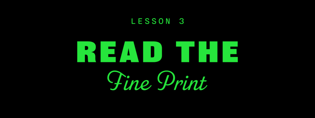
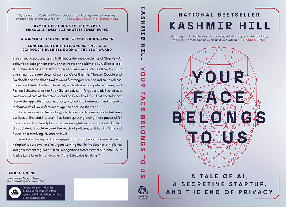
Aside from shirking cover briefs and designing outlandish covers, another thing I’ve done as a junior designer is design mechanicals. Mechanicals are the full layouts for the entire book jacket, including the spine, back cover, and flaps. Some of the biggest challenges I’ve faced with mechanical design are trying to cram in all the necessary copy into the space provided (good books have a lot of blurbs!), shrinking the type, condensing the tracking, and squashing the leading until it all somehow fits!
…Not!
I’ve discovered through some close calls now that the computer is much more forgiving when it comes to typographic errors than the printed page. This is fine when the end product is a website or social media post, but in the business of books, it really pays to print and test out type sizes early, rather than discovering only after you’ve sent your files to the printer that your reading line or blurb is too small to read. On my colleagues’ advice, I now keep a type specimen catalog of my most used spacing, alignment, and sizes of fonts to refer to when designing.
Working at a large publishing house, I now cross paths with a lot of freelancers who are miles more talented than I am: photo researchers, photo retouchers, illustrators, motion designers, and more. Connecting with such a diverse group of accomplished people has really inspired me to keep honing my skills in different software like Illustrator, After Effects, and Blender. While not directly related to my work, I’ve discovered that these skills have proven to be valuable when I’ve needed them the most.
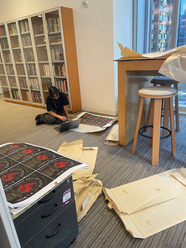
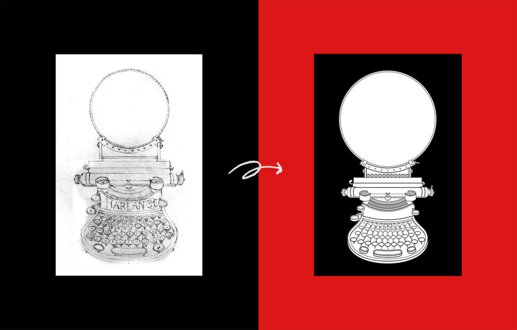
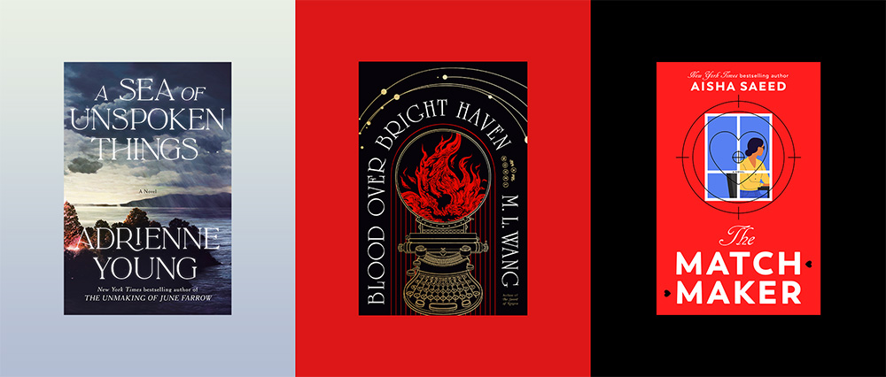
When I worked on Blood Over Bright Haven, we commissioned the amazing Elwira Pawlikowska to create an illustration of the spellograph (an in-world magical item) for the interior of the book. When we realized we wanted to incorporate the spellograph into the cover, we needed a clean vector version of the illustration to more easily apply our various effects. Since the cover design had a different timeline than the interior, I only had access to Elwira’s rough sketch to create the vector design. Because I’d been keeping up with my skills in Illustrator, I was able to execute the design for the vector spellograph right in time for our cover deadline.
In the past six months, I’ve sat through dozens of cover meetings, discussions, and brainstorming sessions where different people have weighed in on my designs, invariably with conflicting opinions.
Since becoming a professional designer, I’ve realized that critique can be multi-layered and complex. In publishing, this complexity is compounded by the fact that there’s such a personal aspect to the design approval process. Even though a book cover is first and foremost a marketing tool, it’s also a representation of the authors themselves.
Throughout the cover approval process, no matter how demanding a particular project can be, I try to remind myself of the author’s stake in the project. Staying flexible and resilient is the key to any creative work, but what makes the effort of book cover design so rewarding in this industry is hearing from an author that they love their final cover.

While intense critique sessions and tricky approvals can make book design feel like a matter of life or death, I think it’s safe to say that, compared to many other professions, mine allows for a healthy mix of creativity, intensity, AND lightheartedness. So, whenever I get stressed, I take a step back and remember exactly how cool it is that I get to marry two of my two favorite hobbies: art and reading. This is a dream job! Nothing is perfect, but I’ve learned to approach every day with a positive attitude, enthusiasm, and gratitude.