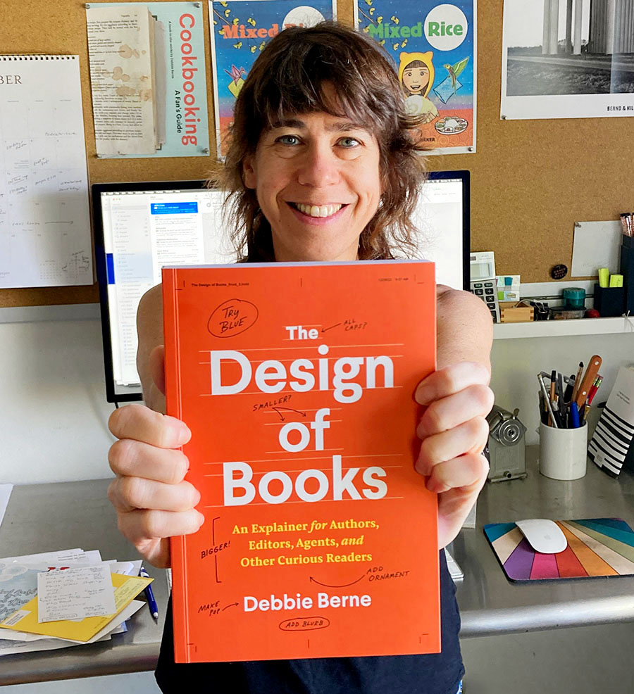
Meet Debbie Berne, a seasoned book cover designer with over 20 years of experience creating book covers and book interiors for various publishers. Her latest endeavor, The Design of Books: An Explainer for Authors, Editors, Agents, and Other Curious Readers, delves into the art and craft of book design. Debbie sheds light on how book design plays a crucial role in achieving publishing success and elevating a reader’s overall experience.
Whether you’re a self-publishing author with questions or a book editor looking to bond with your art director, Debbie’s accessible and insightful guide unveils the secrets behind creating visually stunning and functionally effective book designs. INABC was lucky enough to interview Debbie about her experience of becoming a first-time author and why this book is so important to her.
I’m thrilled to share this fantastic book interview with our readers. The Design of Books perfectly aligns with the INABC ethos, explaining the significance of ‘good’ book design to novices while advocating for self-publishers to make thoughtful design choices.
The Design of Books is published by The University of Chicago Press and is on sale March 12, 2024. Click here to read an exclusive excerpt from Debbie’s book!
Tell us how this book came about. Did you pitch the publisher or did the publisher approach you?
Debbie Berne: It has struck me my entire career how little authors know about the design piece of their books. And so in the staidness of the 2020/COVID summer I thought: could I try to write something about that? I wrote one chapter and a proposal and sent it (agentless) to a small handful of trade publishers. They were all like: nice, but no. Thinking who I should submit to next, I found the Writing, Editing, and Publishing series at University of Chicago Press (publishers of the Chicago Manual of Style! Biggest university press in the country!) sent it blind to editor Mary Laur there and she responded right away saying she had been thinking about publishing a book on this subject for years. Maybe this was the one! It turned out to be!
Did you ever think you would write a book?
Debbie Berne: I started in publishing on the editorial side. I had written as a young person and thought that was the area I would go into (my mother has spent her career as a professional journalist). In my 20s I was an editorial assistant for for a book packager who specialized in illustrated books and she asked me to work up visual samples of some of the books she was trying to sell. She was so insightful: the way to figure out what books are, she believed, is to think of them visually, to see them. Turns out, I was good at it. And I loved it! So I have been tied to the integration of editorial and design from the beginning. But did I ever think I would write a book? It certainly hadn’t occurred to me in the past 20 years. I was designing books!
What was your production schedule like?
Debbie Berne: I sent the proposal in January 2021. The contract came through in September of that year (yes, took a while) and I started writing. I sent in the full manuscript in June 2022 — so basically 9 months of writing. Because it’s a university press, the MS has to be peer-reviewed before they can accept it. That takes a while and it got approved in early 2023. (2 designers and 2 editors read and reviewed it in that process.)
Then it went into copyedit. The copy-editor and I had 2 rounds of back and forth. I designed the book — almost no authors anywhere design their own books, but I did! — the summer of 2023. Proofreading and corrections went on in the early Fall – maybe about 6 weeks. It was sent to print in China in October 2023. Book arrived at the warehouse in Chicago in February.
When did you find time or make time to write? Did this project have to come together while you held down your day job as a designer?
Debbie Berne: I worked on The Design of Books from 6–8am every morning — so before I started my “real” work every day. Every 6 weeks or so I would go away to an AirBnB for a weekend and submerge myself – writing 12 or more hours a day while I was there. (I really loved doing that!) I took 2 weeks off my regular work right before the manuscript was due to focus on finishing.
“Design and production choices are what distinguish beautiful books from mediocre ones and average-looking books from ugly ones.”
-The Design of Books
The subtitle says this book is for “Authors, Editors, Agents, and Curious Readers.” I came across sections that are helpful to a self-publishing novice and other parts that were more appropriate for graphic design students.
How many different people were you thinking about while writing?
Debbie Berne: The original idea was to write the book for self-publishing authors, who I felt needed the info the most. They don’t have the professionals of a publishing house to support them and often are paying low prices for weak covers — or trying to do the covers themselves. The software and websites that “design” their interiors do an automated, and rather mediocre, job. Maybe I could teach them a thing or two? But as I was developing the sample text, it occurred to me that EVERYONE in publishing could benefit from this info. The authors with publishing houses, even the editors who work in publishing every day, could profit from a little more insight into how design functions in relation to the writing/language/idea of books.
I do think (or at least hope!) that graphic design students and other book designers will enjoy this book, but it is distinctly NOT instructional. I am not teaching self-publishing authors how best to execute their own covers, but instead helping them see that hiring a decent cover designer is worthwhile. It’s about why and not how. (INABC added emphasis).
What should a self-publishing author consider if they’re stuck between producing a hardcover edition or a paperback edition?
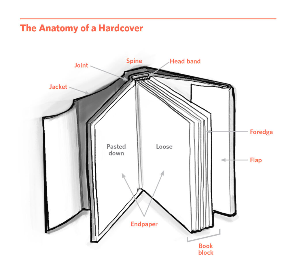
Debbie Berne: In my mind, hardcovers are only needed for specific kinds of books: children’s picture books, art books, cookbooks, “gift” books, some reference, and textbooks. But for text-driven trade books — both fiction and non — what’s the point of printing in hardcover? It costs more to make, it costs more to buy. It is more wasteful. And it’s not any better to read. Hardcover has been considered higher status forever. Can we move away from that idea? I come down strongly on the side of the future of the paperback. For us all! (And yes, my book is being published as a paperback.)
To a seasoned graphic designer, the concept of fonts falling in and out of fashion is an obvious one, but this might be a new idea for a writer.
Could you elaborate on how certain fonts have their ‘moments,’ and why authors should trust their designer’s judgment if they suggest that a certain font appears ‘dated’?
Debbie Berne: The fact is that folks who are not graphic designers — including authors — know very little about fonts. Some people have heard of Times New Roman (from their Word doc) or Comic Sans (because it has a (funny) cultural presence), and the most sophisticated among them may have heard of Helvetica or Futura or Bodoni. That’s generally the extent, and most barely even get to those. But as designers know, there are thousands and thousands of fonts in the world — some hundreds of years old (and still being used), some brand spanking new. And for us, each one has its own expression, meaning, vibe.
Yes, sometimes specific fonts have a moment for book covers. Or maybe more commonly, a style of type has a moment. The font Lydian was having a few hot years recently. And I would say that right now we are in a phase where highly decorative, a little abstracted, and somewhat kooky serifs are in vogue. But these are really only applicable to literary fiction. Romance novels or mysteries or sci-fi — genre fiction — have their own type styles and trends they follow. And other kinds of books — say memoir or self-help or business books — each have their own styles, too.
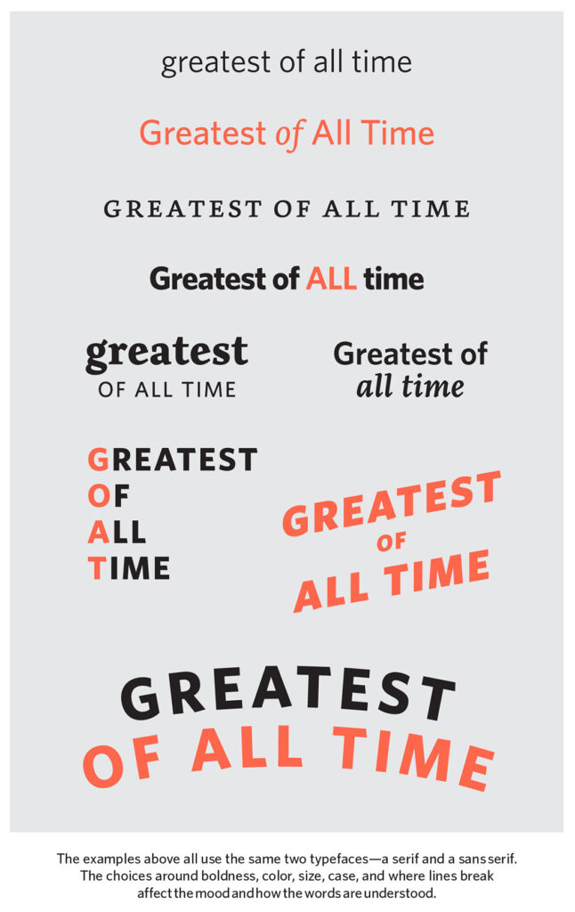
Book covers follow fashion like everything in our consumer culture. Cover designers are the ones that are in tune with where that is at any given moment. And designers understand not only type trends and book genres, but what fits with what, and whether each, individual book makes sense to be trendy — or if a more classic, or otherwise different mode, is a better fit. The very best cover designers push visual fads and step outside of them, often inventing new ones.
You’ve now joined Peter Mendelsund and Tree Abraham in the small club of book cover designers who designed a cover for their own book!
Peter has expressed having mixed feelings about the experience, while Tree said on a podcast that she loved being responsible for hers. What was it like for you to design the cover of YOUR very own book?
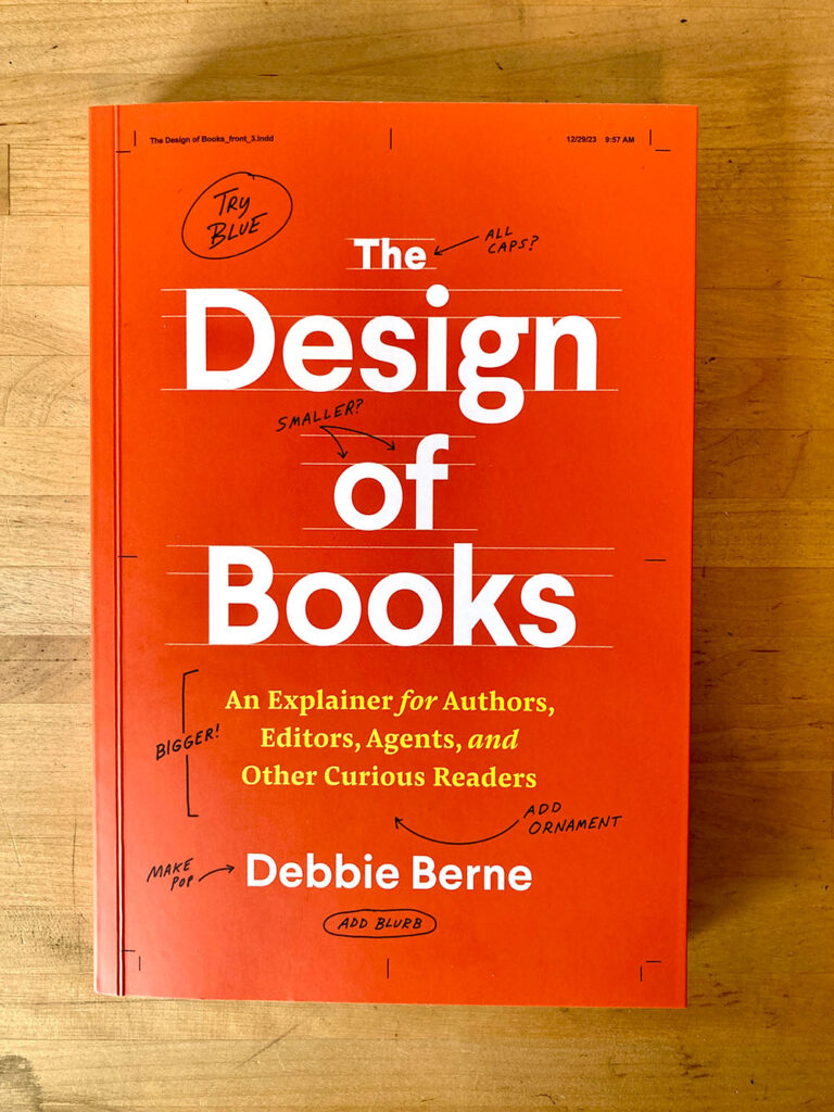
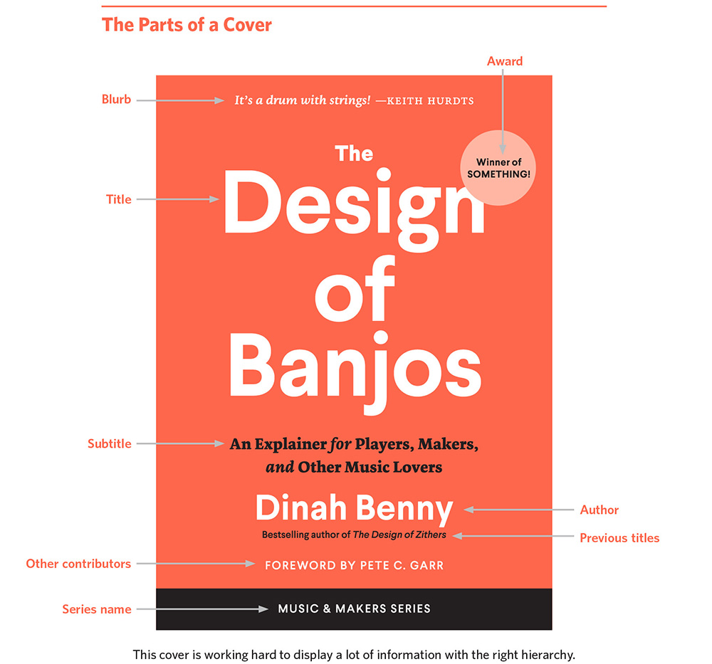
Debbie Berne: I had my front cover design idea from the initial proposal phase — I was sending it around trying to sell the book — and it barely changed when I was officially designing it for print. It seemed so clear to me: I wanted to show the kinds of comments and requested changes that come back to cover designers all the time on the covers they are working on. Leaving the file info/crop marks on there is mischievous (and fun to me. Many designer friends have commented to me on that aspect when they see the cover). It is a book cover which reveals the book cover design process. Seemed right! So I would say I really enjoyed designing my cover. On the other hand, designing the interior — which I also did — was much more challenging and much less “fun.”
Tell us 3 things that someone who has never laid out a book before might find surprising about the typesetting process.
Debbie Berne: Authors write their book in single “pages,” a vertically flowing document. But readers are going to encounter the work on smaller, physical, facing pages which must be turned. This shift is notable — the format in which books are written and how they are read is distinct.
Interior book designers are handed manuscripts as a Word document and it is our job to transform that into a book. The first thing we do is create a file the prescribed size of the physical book. And this size is almost always dictated to us by the editorial team (or for self-publishers, the authors) —they’ve decided what size the book should be. (Note: talking this through with a designer before you commit to a size ain’t a bad idea.)
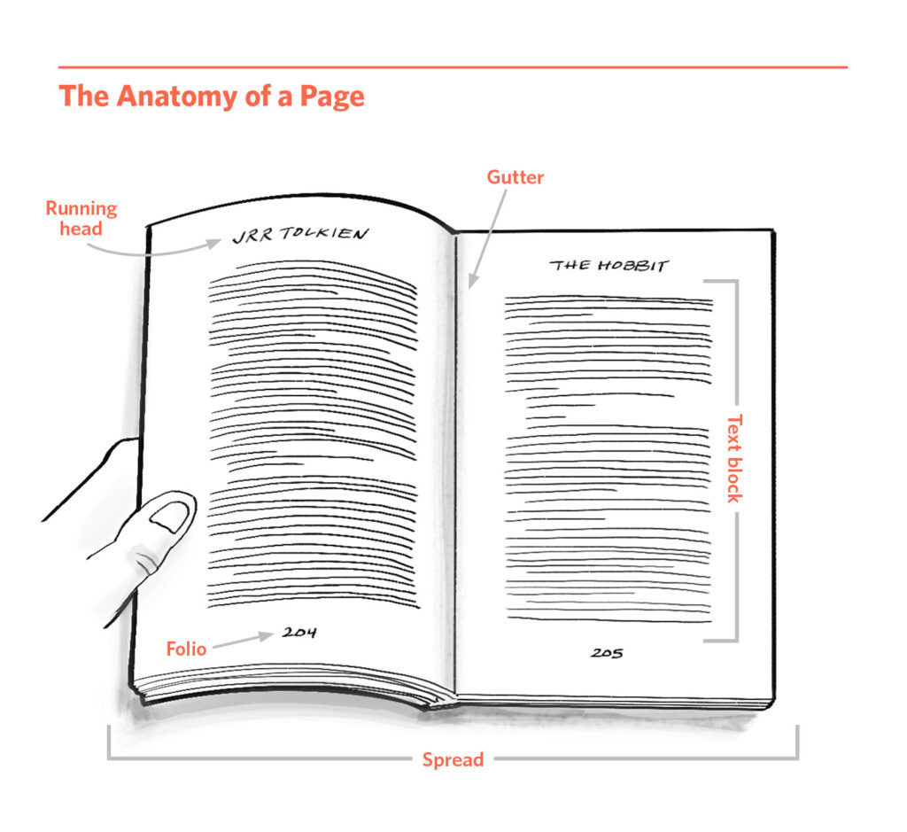
There is something important for designers to decide off the bat and that is how big should the margins be. That is, how much empty space is going to surround the type? The more space = the more status. I always say it’s like Downton Abbey — an estate on acres of land — versus the village down the road where everyone lives close to one another. The space around an estate helps confer its prestige, the space around the type does that for a book. But empty space also makes books longer. Smaller margins allow more text on the page. Think about the paperback romance from the drug store vs the bestselling literary author’s new novel. Those books have a notable distinction in how big the margins are, which indicates a notable distinction in their status as well.
Another basic part of what interior designers do is think about chapter opens. (The entirety of a chapter heading is called a chapter display which includes the chapter number and/or chapter title and/or any other info the author wants there: subtitles or quotes or descriptive info like the time and place the events are unfolding or what-have-you.) Chapter displays are a place where a book shows something about its vibe. Are those displays in a decorative italic or a modern san serif? A traditional serif or a “handwriting” font or something that feels grunge or casual or swashy or techno? Are they centered or left-aligned (or, on occasion, right-aligned)? How far down the page do they begin and how much room between the chapter display and the beginning of the chapter text? What happens at the beginning of that text – a drop cap? A word or a few in all caps? In bold? All of these design decisions express style, even meaning, to the reader. They help readers understand: what is this book?
“Again and again I hear authors delighted at seeing the loosely organized jumble of their Word document reborn as the tightly controlled, stylish form of a considered layout. Authors guide their readers through a book with language. Designers use space and typography. When this is done well, the mechanics of the writing and the design virtually disappear. The hands turn the pages, but the mind is elsewhere, slaying dragons.”
– The Design of Books
If asked, “Do you want your book printed on white paper?” I think a lot of authors would answer “Yep!”
But you point out that: “Stark white paper is hard on the eyes, and books meant for extended reading are usually printed on soft white papers, often called natural, which are warm and creamy.”
What are some other tips that a publishing novice should consider when choosing their paper stock?
Debbie Berne: The other thing for authors, particularly self-publishing authors, to consider is the weight/heaviness of the paper. The lighter the paper, the cheaper it will be to buy, and the lighter the book will be. That’s nice! On the other hand, if it’s too light, the printing is visible through the page and that is distracting as you read, and not nice. When choosing papers you are looking for the right weight: light enough, without being too light. Always ask printers to send samples of their text-weight papers for you to assess with your eyes and hands.
There are inevitable environmental costs to publishing in print. What are some choices that an environmentally-conscious author can make to reduce their book’s carbon footprint?
Debbie Berne: Most important is to use recycled (or at least partially recycled) papers and non-toxic inks. Most US-based printers are now doing that, but it’s always important to confirm with your printer. Paperbacks are more environmentally sound than hardcovers — there’s just less materials being used. And never have your book shrinkwrapped! Not necessary and totally wasteful.
5 Key Takeaways from
The Design of Books
1.
The physical aspects of a book are part of its design. Format (paperback versus hardcover) and size express a lot about what a book is and how it is meant to function.
2.
Book designers spend a lot of thought and experimentation choosing which font is right for each book — both on the cover and inside the book. Every font expresses a different vibe and we want the type to match, and even enhance, the meaning of a book.
3.
Book covers should look classy regardless of the kind of book and the visual direction of the cover. They are the first thing readers encounter and in every instance should be created by an experienced book cover designer (not a general graphic designer, not a discount graphic designer, not your cousin).
4.
Well-done interior design creates ease and clarity and pleasure for readers as they make their way through a book. It is highly worth investing in meaningful interior design so your readers can enjoy your book.
5.
The Design of Books describes how authors — both those working with a publishing house and those self-publishing — can best participate in the design piece of the making of their book, an essential part of getting their book ready for the larger world.
A million thanks to Debbie Berne for taking the time to answer my questions! The Design of Books is published by The University of Chicago Press and is available now. Get your copy today!
If you’re dying to know more about Debbie’s incredible book, click here to read an exclusive excerpt, featured on the INABC blog.
*All infographics are © Debbie Berne/The University of Chicago Press.
*All gray illustrations are © Vivian Barad.