This is 10 Questions, an interview series between INABC and our talented friends from the Book Cover Designers’ Directory. Today, get to know Matt Roeser! Matt was previously an Associate Art Director at Candlewick Press but is now freelancing full-time. He answered my questions from Boston while his pup sat at his feet. You can visit his portfolio site here.

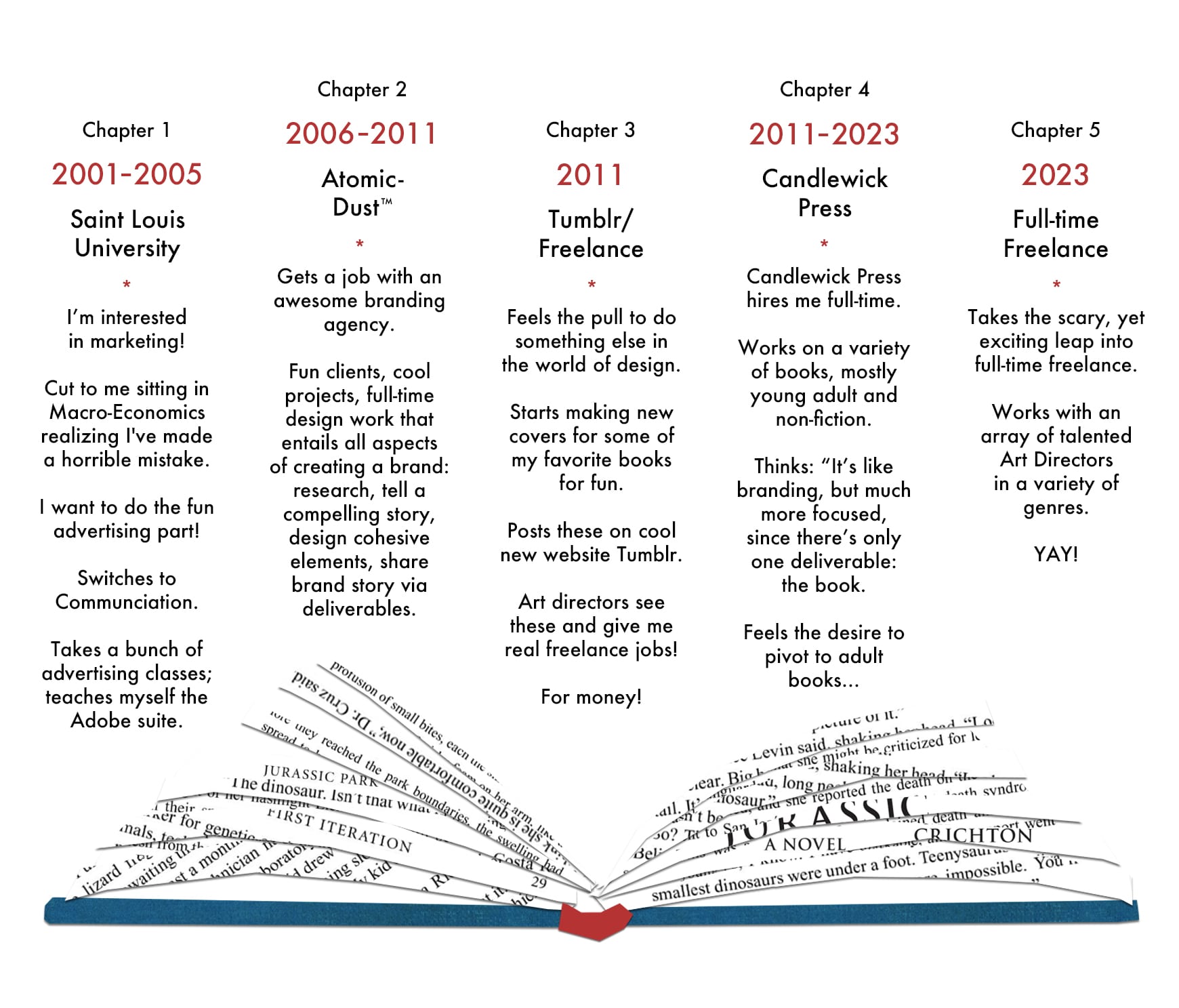
1. Visually take us through your professional journey. Create a diagram that summarizes your career to date.
2. When did you realize that you wanted to become a book cover designer?
Matt Roeser: I think I realized it long before I actually understood it was a job someone could have. I’ve always been a big reader and have always been drawn to design. But it all goes back to Jurassic Park. I was ten when the movie came out and my older brother and I saw it at least 5 times in the theaters. And then he got the book, and I remember that being the first “big”, “adult” book I read, and just loving it, but especially being drawn in by Chip Kidd’s classic cover design (that in turn is used everywhere in the movie). That was definitely the catalyst that activated my love for book covers. Unbeknownst to me at the time, I was either going to be a book cover designer or a paleontologist (still love dinosaurs!).
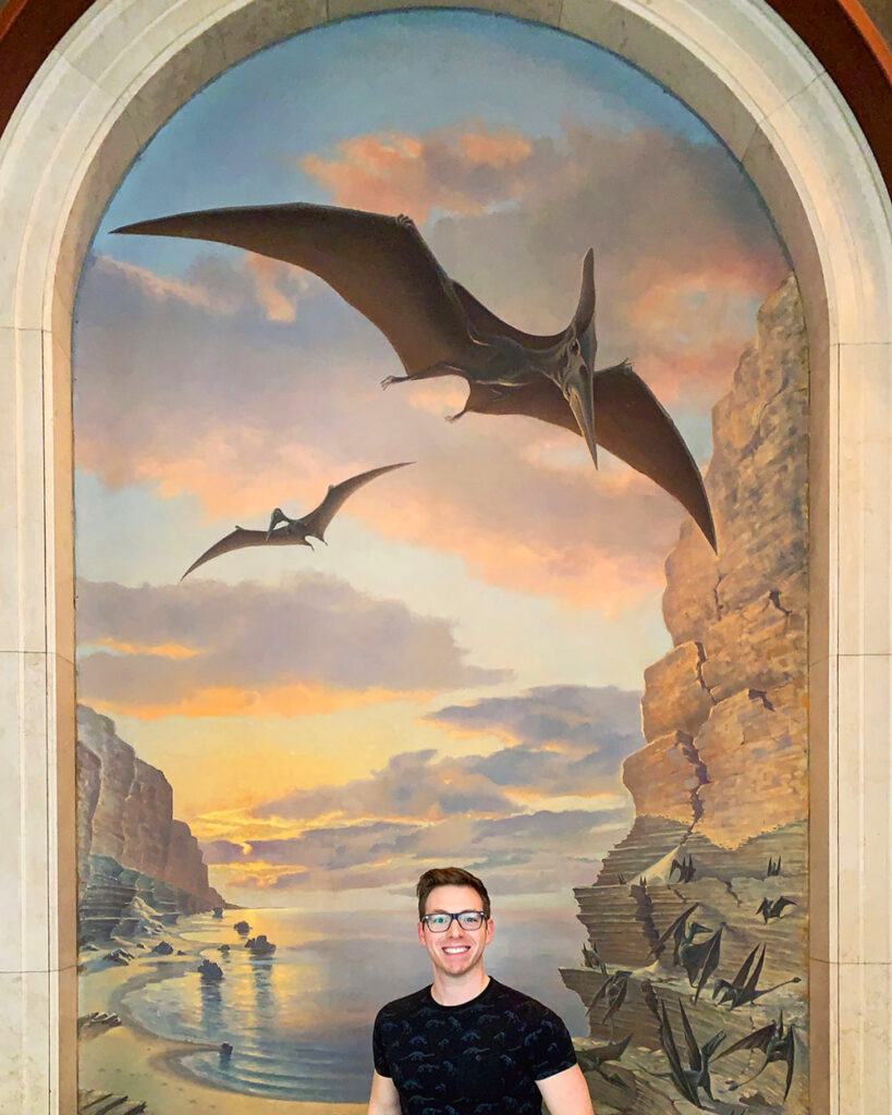
3. How do you use Instagram?
Matt Roeser: Like everyone, I have a love/hate relationship with social media. On the one hand, it’s an incredible source of design inspiration: staying in contact with other creatives, seeing what they’re doing, motivating me to constantly improve. On the other, it’s a complete time-suck. And as a freelancer, it’s necessary to maintain some social media presence in order to continuously get and share work. So finding that balance is a struggle. But when I realize I’m slumped over my desk, sending the same reel of an influencer making nachos in their kitchen sink to a friend for the second time, I set the phone down and get back to work.
4. Where do you work?
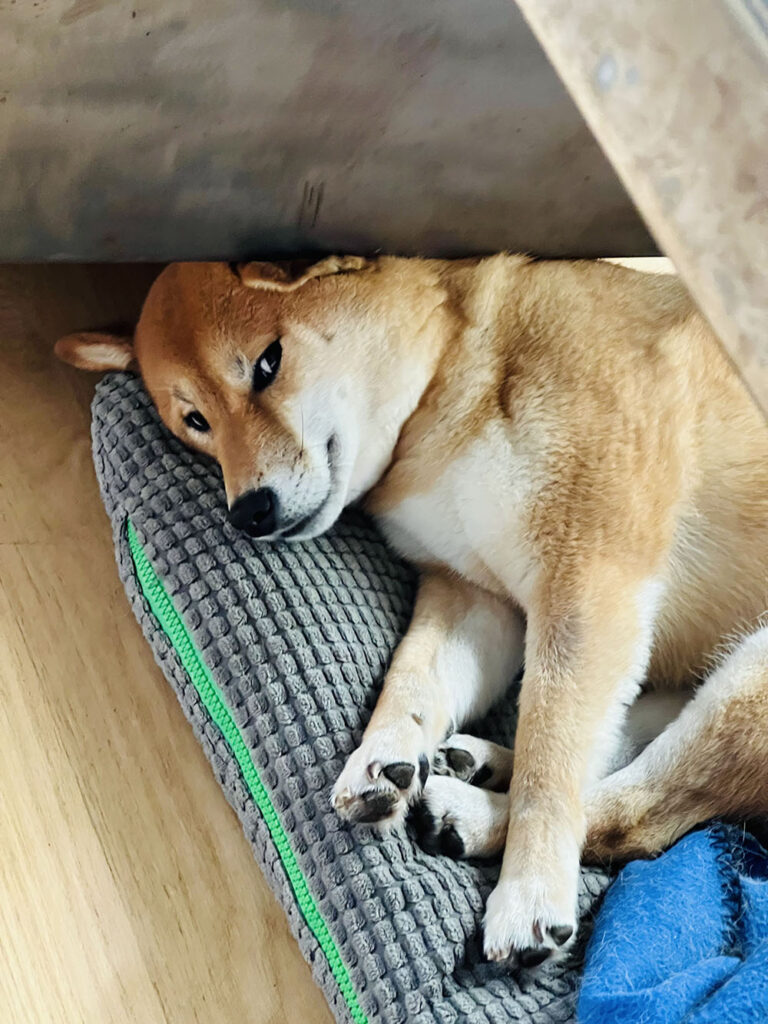
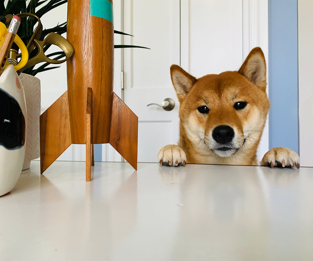
Matt Roeser: I’m fortunate to have an office in the apartment my partner and I rent. It has huge windows, so it gets a ton of light, so I’ve filled it with my other true love besides books: plants. Unsurprisingly, I’ve got tons of books, so when I found these lockers online, I knew they could be a fun way to organize some of my collection. I spray-painted them metallic silver and, what started out as being organized by genre in each little cubby has now become just a hodge-podge of never being able to find any book I’m looking for. Like all readers, one day I want library shelves with a rolling ladder, but for now, this will do. I work at this huge tanker desk from the 60s that has the most built-in storage I’ve ever seen, which helps keep me organized. In the photo below, you can see the office in its most organized. Since that photo, I’ve gotten a proper monitor (I can only design on a laptop in a pinch) and a comfortable work chair. And I’m proud to say that all of the plants are still alive! I’ve also included a photo of our dog Kirby who sleeps at my feet from 9-5 each day. He’s very distracting in the best way possible. And when he’s not asleep, he likes to lean against the desk and stare at me quietly to tell me it’s time to stop working.

5. Describe your typical work schedule. Everyone is different!
Matt Roeser: Coming from working in-house for so long, I find that if I don’t try to adhere to the usual 9-5 workday, I end up not getting much done. In addition to freelance cover design, years ago, I wrote a picture book, and I’ve been wanting to work on more ever since. Now that I can make my own schedule, I’ve tried to keep a healthy balance between the two creative ventures. I feel like whenever I try and plan out my day or week too much, that’s when all hell breaks loose, so I try to keep it a little more flexible with goals for the week rather than daily tasks.

6. What’s one creative skill you wish you had time to pursue so that you could incorporate it into future designs?
Matt Roeser: I wish I could draw. I’m working on “illustrating” a few picture book ideas I have in a very graphic, paper-cut style, but sometimes I wish I could just draw exactly what I want like so many of the talented illustrators I know. But I’ve accepted that I can’t. Every time I sketch a few things for a jacket, it goes like this: 1) ok, that doesn’t look too bad, let’s scan it 2) scans it 3) opens Photoshop: this is the worst thing I’ve ever seen! ~fin~ So I just stick with the more bold, graphic shapes.
7. We all know that great covers get killed. How often does something you submit get chosen in the very first round, and how often do you have to go through multiple rounds before you get approval?
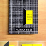
Matt Roeser: When I was in-house, I found that the crazier the idea (“no jacket, we’re going to do a die-cut through the case and print the title on the endsheets! See!!!”) the more times it got approved instantly. (This actually happened for a book I designed called More Than This by Patrick Ness). To be clear, it didn’t happen often, but I found those the most thrilling, because as I’m sitting there mocking it up, I’m thinking “the group is either going to LOVE this OR I’m going to get fired.” And I like that sort of no in-between pressure.
If I had to give you numbers, I would say the insane-idea-instant-approvals sit at maybe 5%, the very minor tweaks at 15% and then the multiple rounds of revisions at 80%.
8. What is one book cover from your archive that you feel is especially great, but never received much press or notoriety for some reason? We’ve all got one or two of those in the archive! Send me a JPG and tell me why you love this forgotten-about child.
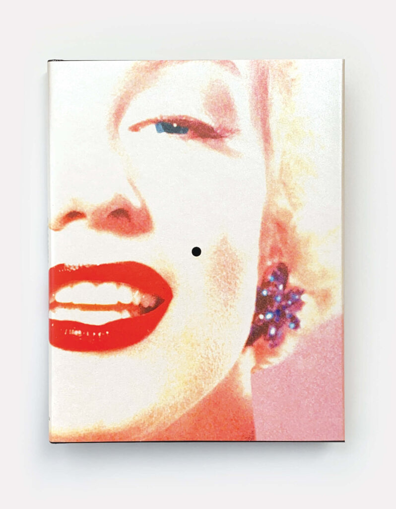
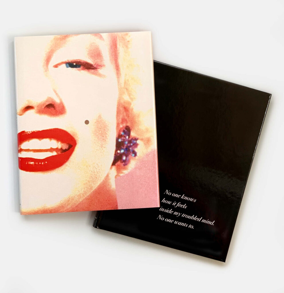
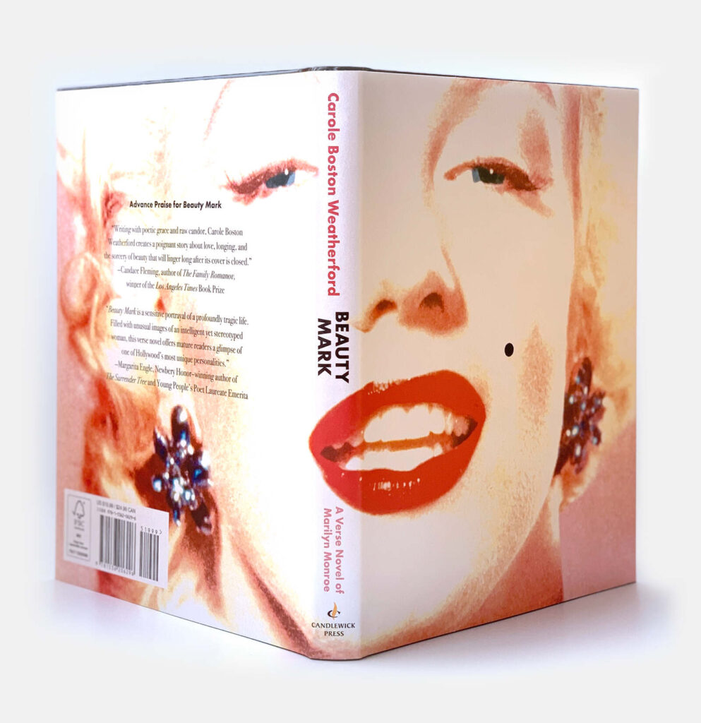
Matt Roeser: When I was at Candlewick, I worked on the jacket for a novel in verse about Marilyn Monroe by Carole Boston Weatherford called Beauty Mark. This is one of those insane-idea-instant-approvals I got. The book was pitched as sort of peeking behind the “character” of Marilyn to the real woman inside. So I thought of ways the reader could experience that with the jacket and arrived at: why not have a classic image of Marilyn, and a small die-cut hole where her famous beauty mark was, revealing the black case behind it. No text on the front. It’s called Beauty Mark, there’s the beauty mark, as sort of a portal into the woman behind the glitz. It’s printed on a pearlescent stock and the color is sort of blown out like she’s in front of a thousand cameras. The group loved it and everyone was so excited. I remember a comment from the Covers Meeting along the lines of “this is going to be one of those books in the bookstore you see from across the room and it just calls to you.” And then the pandemic happened and the book came out in the summer of 2020 when all of the bookstores were closed. So I think it just sort of sat quietly as a thumbnail on Amazon for a while. What can you do?
9. Name one author you would love to design for before you retire.
Matt Roeser: David Mitchell. I adore his books, that they’re each puzzle boxes layered upon each other and that he’s also creating a larger connected universe for all of his characters. Thankfully, his books have received some stellar designs. My favorite being for the hardcover of Slade House (again, I’m a sucker for a die-cut through the case!)
10. The INABC Exit Question. You’re at a party and you just told a stranger that you’re a book cover designer. What’s the most common response you get from people when they hear this?
Matt Roeser: I find that I always get one of two responses. The depressing response is “oh, are people still reading?” (as if it were a fad like fro-yo) to which I quickly find another stranger to talk to.
The more exciting response is “that sounds like the coolest job ever! Tell me everything!” and I proceed to talk with them the rest of the party.
