*Blog post cover image borrows from Keith Hayes’ book cover design for Donna Tartt’s The Goldfinch, published in 2013 by Little, Brown and Company.
The History of Trompe l’œil
Trompe l’œil (pronounced tromp-loy), literally means “deceive the eye” or “trick of the eye” in French and is a term that has been used in art since at least the 1600s.
“Trompe-l’oeil is a painting technique where a painted object is depicted so realistically that it seems to exist in real space. [The term] was coined by the artist Louis-Léopold Boilly in 1800, but the technique itself is far older.” —Art History Project
Think of a painted curtain that looks like it’s really draped across a wall, or a portrait where the sitter’s arm appears to creep outward, casting a shadow on a painted gold frame. And it just so happens to be one of my favorite art techniques ever 🙂
Artists from multiple periods and movements have used it, but it doesn’t belong to a single “ism” like Impressionism or Cubism. It’s more of a method of illusionistic painting that focuses on tricking the eye into seeing three-dimensional reality on a flat surface.
The magic of trompe l’oeil isn’t just in making something look hyper realistc—it lies in how the artwork engages with and activates the shape it inhabits, transforming a two-dimensional medium into a convincing illusion of depth and form.
With this in mind, we explore book covers that successfully achieve this niche kind of visual deception.
Early Examples of Trompe l’œil
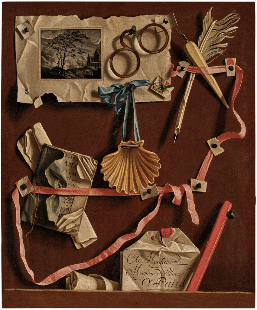
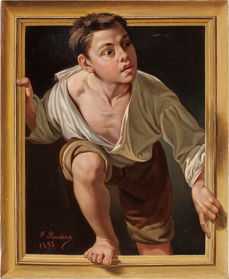
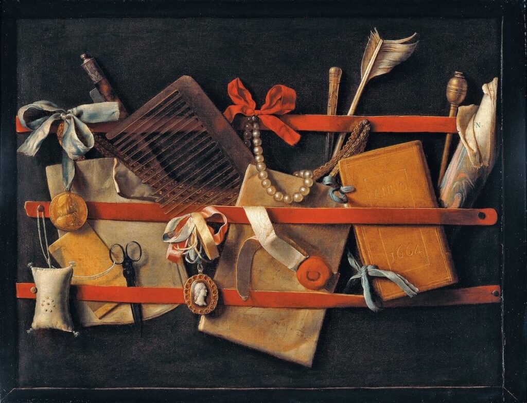
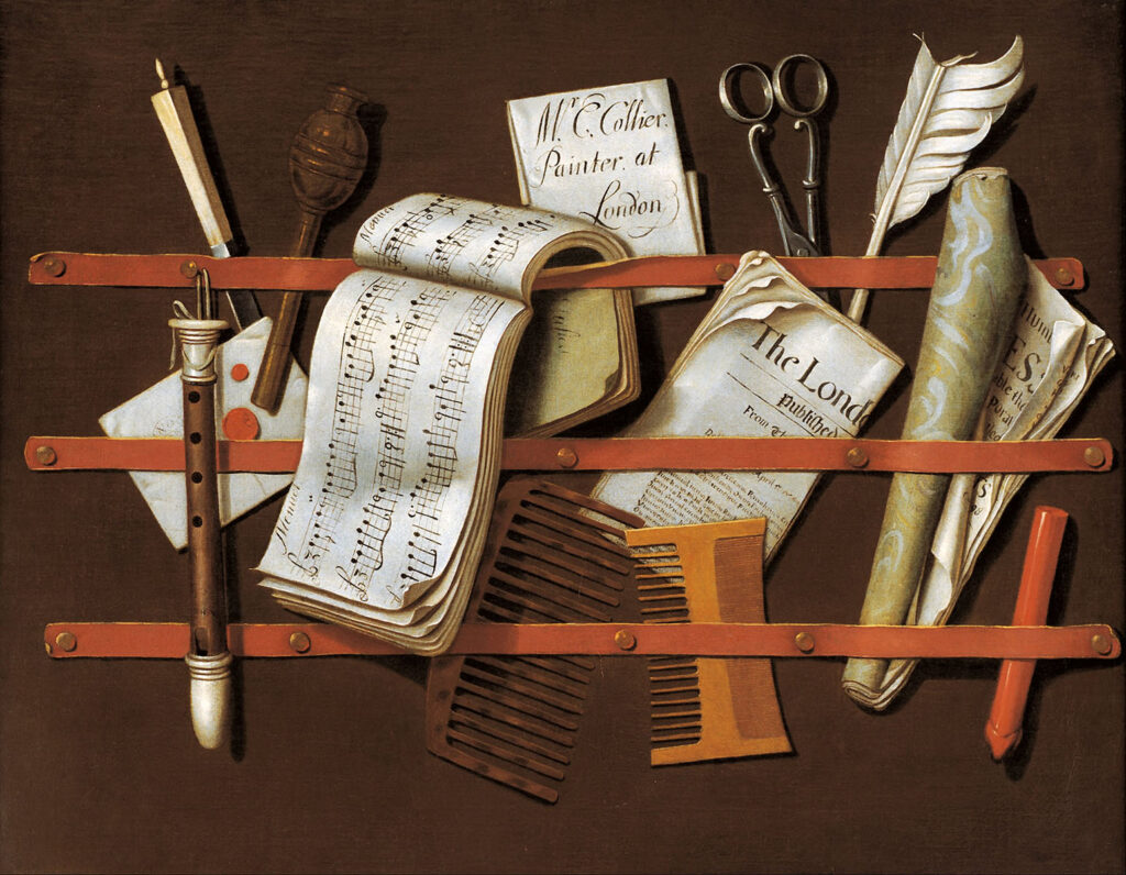
From top left: Jean Valette-Falgores 1777, Francisca Rodero y Gregory 1893, unknown, and (bottom) Edward Collier 1698.
Applying Trompe l’œil to Book Covers
Over the years, book design has seen several truly ingenious moments in which designers have drawn on this same principle.
But before we take a look at some examples, it’s important to make distinctions about this category.
A cover can appear extremely photorealistic, but that doesn’t automatically make it trompe l’oeil.
For a book cover to truly qualify, as seen in our collected examples below, the design must speak to the book’s physicality. A cover designer might do this by acknowledging its spine or rectangular shape, by “revealing” the pages below, by emphasizing textures in the paper jacket itself, or by creating realistic shadows that make objects appear to sit atop the book’s surface.
The best examples of a trompe l’oeil book cover design relate to the object’s inherent ‘bookness.’
Some examples of how this can and has been achieved include:
- A cover that “reveals” a book’s pages sitting below the jacket
- 3D tape with hyperrealistic shadows that seem to protrude outward toward the reader
- A belt that “appears” to wrap around the book itself
- Tactile paper textures and exagerrated rips that make the viewer “feel” the physicality of the book as an object
- Art that wraps to the confines of the book’s rectangle, highlighting the confines of its shape.
Trompe l’oeil has never been about realism alone. The great practitioners used the canvas as an active participant in the illusion, allowing the surface itself to become part of the trick.
A well-executed trompe l’oeil book cover follows that same principle, emphasizing the book’s physical boundaries and material presence. Rather than behaving like a pasted-on photograph, the design elevates and transforms the object into something that feels dimensional and tangible.
In other words, a real trick of the eye!
Why Trompe l’oeil Covers Stand Out
A trompe l’oeil cover can:
- Trick the eye, creating a lasting visual impression
- Demand attention by making readers do a double-take
- Give a sense of care and craft in the design, signaling immense quality before a reader even opens the book
The goal here is a tiny, optical, magic trick that invites the reader to pick up the book and investigate this story even further.
Below, we’ve curated a selection of book covers that exemplify trompe l’oeil in action—notice how each design engages with the book’s shape, texture, and material to create a strikingly real effect. . .
Revealing A Book’s Pages Below
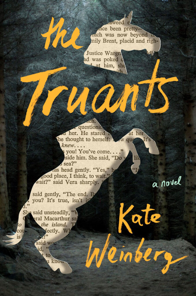
Kate Weinberg’s 2021 novel “The Truants” features a design by Tal Goretsky. This illusion would not be as successful without the subtle shadow separating the cover from the pages below, and also the crisp white line that hints at the thickness of the cover that Tal “cut” into.

Above is Chelsea McGuckin‘s 2023 design for “The Writing Retreat” by Julia Bartz. The folded back pages in the bottom right corner look SO real that the viewer might wince when looking at it. Dang! You’ve already ruined your brand-new book! A mark of success.

Like the Old Masters who painted representations of a gold frame around a canvas to fool the viewer, designer Holly MacDonald cuts into the book itself for “You Are Fatally Invited” by Ande Pliego. The pen and typography appear embedded within the book itself, making this a standout example of trompe l’oeil in book cover design.

In FSG’s Unfinished Business (2020, designed by Na Kim), the front cover appears to be missing entirely and we’ve skipped ahead to page 180. The cover information is artfully “silkscreened” onto the inside pages.
Realistic Tears, Rips, and Folds in the Paper
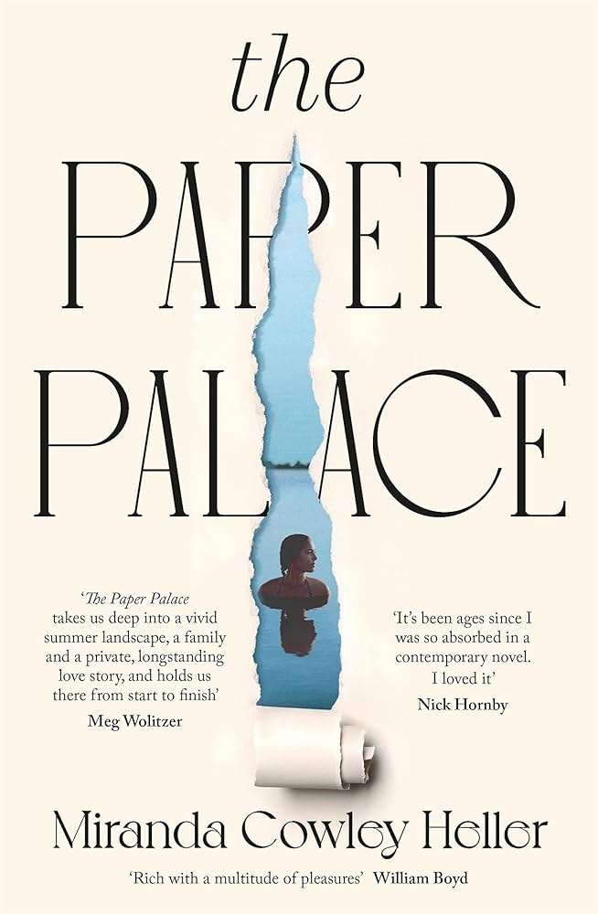
The following group of covers all fall squarely within the trompe-l’œil tradition, even if the illusion isn’t literal.
In each case, the designer uses rips, tears, or layered paper shadows to call attention to the book as a physical object—its jacket, its surface, its materiality.
In the examples below, what’s revealed beneath is not a book’s pages (contrary to the grouping above). Instead, we see a photograph or a painting. But the gesture still works as trompe-l’œil, because it plays on our expectation of paper and depth, inviting the reader to momentarily forget that what they’re seeing is a flat, printed surface.
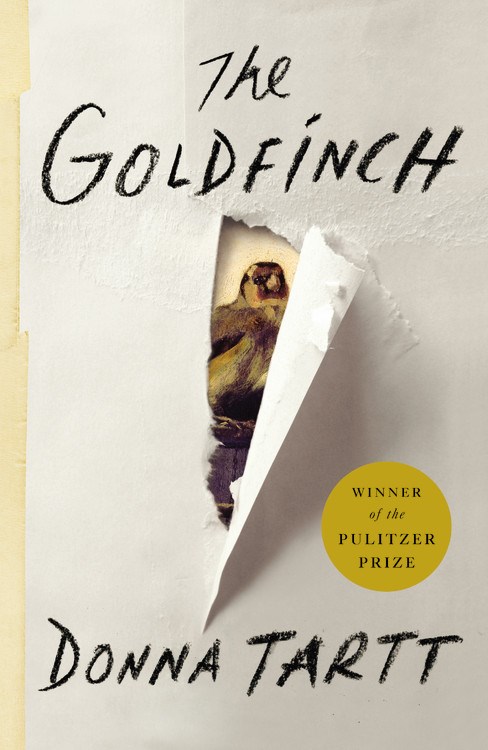
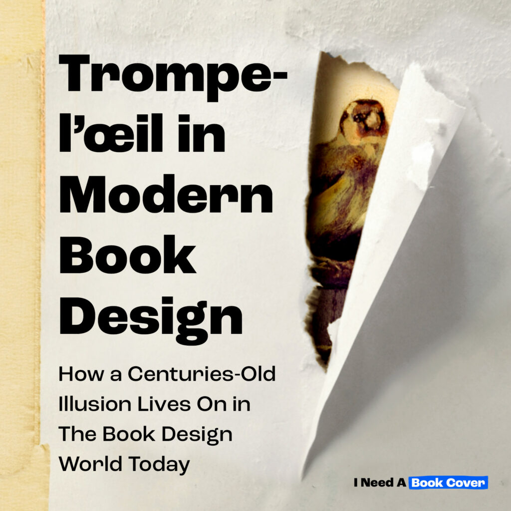
When The Goldfinch was released in 2013, Keith Hayes’s jacket design made an immediate and lasting impact. Yes, the novel was a commercial phenomenon, but the cover itself became a hit within contemporary book design for its masterful trompe l’oeil execution. While the idea of a torn paper reveal was not entirely new, Hayes rendered the rip with such convincing dimensionality (complete with delicately shadowed edges and rough fiber detail) that the illusion felt startlingly real. Paired with his scratchy, handwritten typography, the effect was both raw and refined.
And crucially, the concept is inseparable from the story itself: the stolen painting at the heart of the novel quite literally peeks out from behind the tear. The result is a cover that is not only visually arresting, but narratively exact—an exquisite alignment of concept, craft, and content.
2024

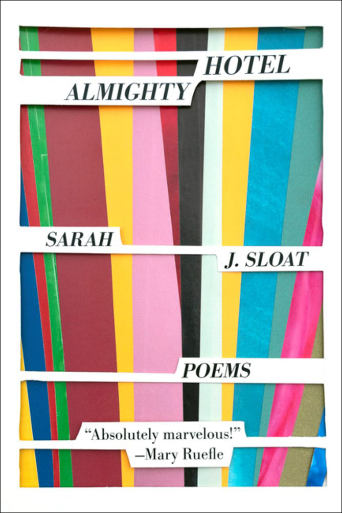
2018 • Design by Committee
2024 • Arsh Raziuddin
2020 • Designed by Danika Isdahl

2020 • Designed by Henry Sene Yee

Graceful Burdens by Roxane Gay (2020, Amazon Original Stories) was designed by myself, Zoe Norvell. See the entire Out of Line Collection here! Each of the 7 books features cut-outs and dual layers in numerous ways.
Objects Popping Right Off The Cover
These covers use photography, carefully placed objects, and meticulously rendered shadows to create the illusion that elements are breaking free from the page—appearing to lift, hover, or protrude from the book’s surface.

2022 • Designed by Strick & Williams

2009 • Designed by Gabrielle Wilson
2013 • Designed by Keith Hayes

2015 • Designed by Alison Saltzman
2020 • Designed by James Iacobelli

2020 • Henry Sene Yee
The overly-exaggerated curling tape and expertly placed shadows are effective in solidifying the cover’s 3D effect in Sigh, Gone.
2024 • Published by Penguin Press

2025 • Published by Penguin Press

What makes The Palace of Forty Pillars cover so convincing is the way the upper paper layer fits seamlessly within the book’s borders. By echoing the exact trim, it feels as though a separate sheet has been carefully placed on top of the book. The subtly uneven, hand-cut edges of the paper and folds in application further enhance the illusion, reinforcing its handmade quality and making the layer feel physically present. Published by Tin House Books in 2024.
Covers As Covers
In this section, the cover becomes self-referential, deliberately calling attention to its own bookness. By mimicking handmade bindings or the wear and patina of old volumes, these designs remind the reader (quite explicitly) that what they’re holding is a book.

2018 • Designed by Ben Denzer
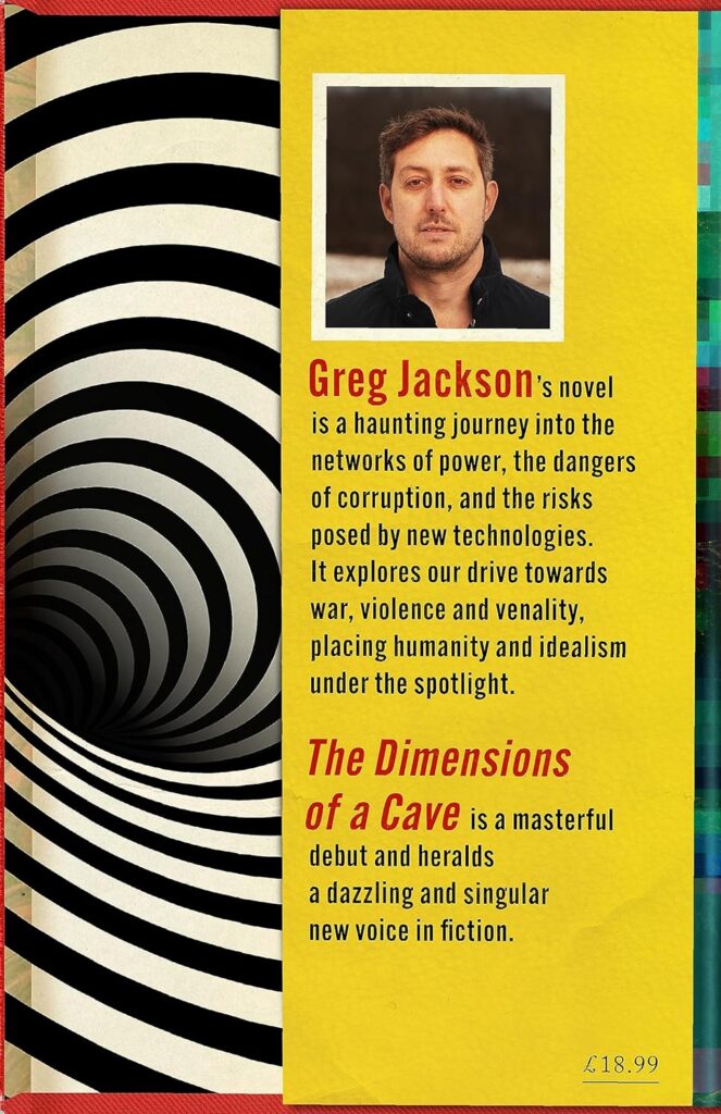
Jamie Keenan’s 2023 cover for The Dimensions of a Cave is SO self-referential that I almost didn’t know where to include it. Keenan has taken the visual language we associate with the inner back flap and placed it squarely on the front cover. In turn, the back cover features what we would normally expect to see on the front flap—essentially turning the book inside out!

2024 • Peter Selgin
Honorable Mentions
Not every cover in this collection fits neatly within the “strict” definition of trompe l’oeil, but each brushes up against it in compelling ways. Whether through tactile suggestion, material illusion, or playful dimensionality, these honorable mentions sit comfortably under the umbrella, inviting the reader’s eye to pick this up!

The construction paper and 3D googly eyes in David Drummond‘s “After Realism” (by Andre Forget) are incredibly realistic and tactile. The paper shapes fit so perfectly within the confines of the book’s edges.

2020 • Designed by Jamie Keenan
Designed by Isaac Tobin
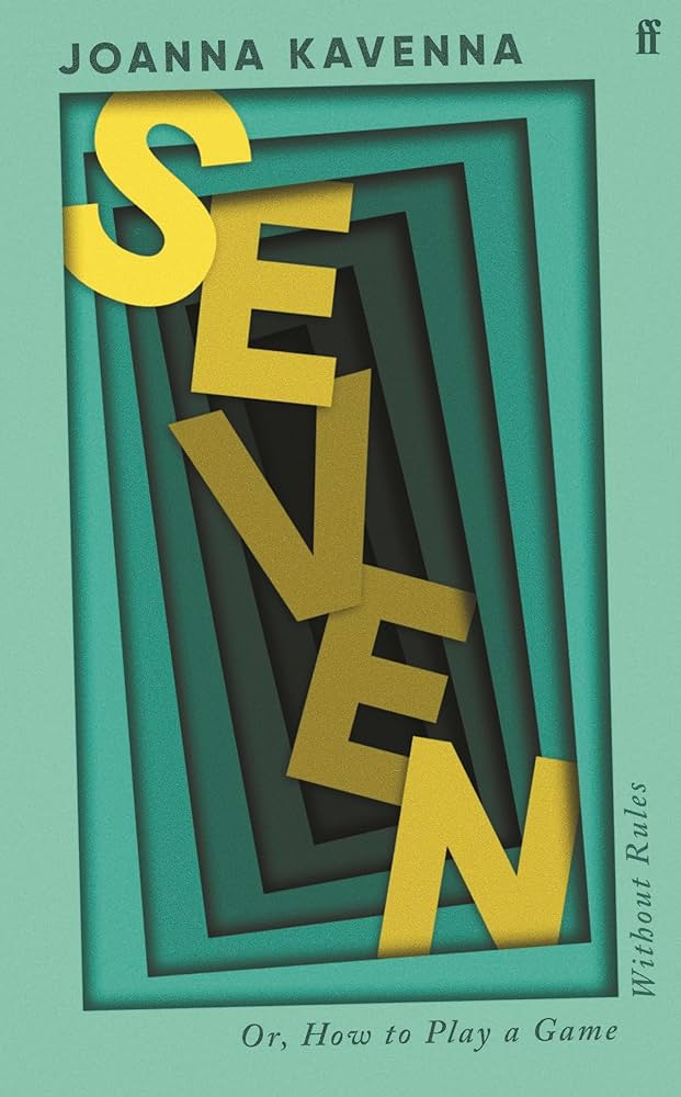
Faber&Faber’s cover for Seven by Joanna Kavenna definitely gives the illusion that the yellow letters making up the title are receding in space, as if this book were a shadow box. This cover is certainly a trick-of-the-eye and deserves an honorable mention, but it’s perhaps not a “true” example of book trompe l’oiel because the image recedes into an imaginary space (unlike the cover for You Are Fatally Invited which recedes into the book itself).
2024 • Designed by Jamie Stafford-Hill
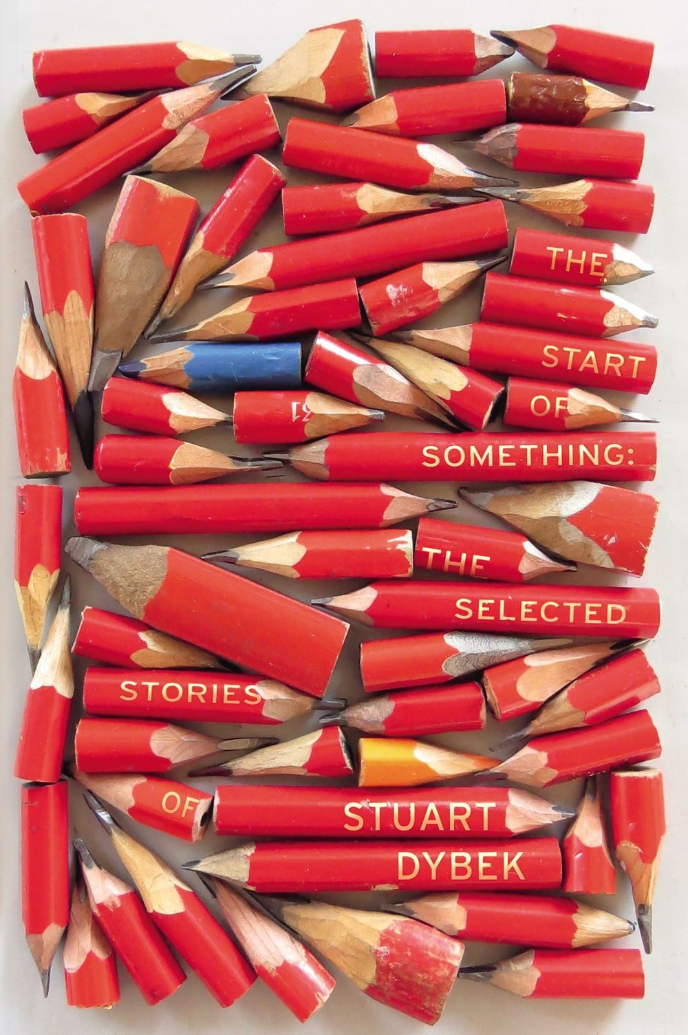
The success of Suzanne Dean’s 2016 design for The Start of Something lies in the way the pencils conform precisely to the shape of the book. By respecting the trim rather than bleeding off the edge, the composition feels contained and intentional. Had Marion de Man’s photograph extended beyond the book’s borders, the design would exist as a simple photograph—losing the object-like tension that makes it so compelling! These are the reasons this cover design was named as one of the best of the last decade by LitHub.
Contemporary Artists Playing With Trompe l’oeil
Below are some incredible contemporary artists who are keeping the trick-of-the-eye technique alive today!
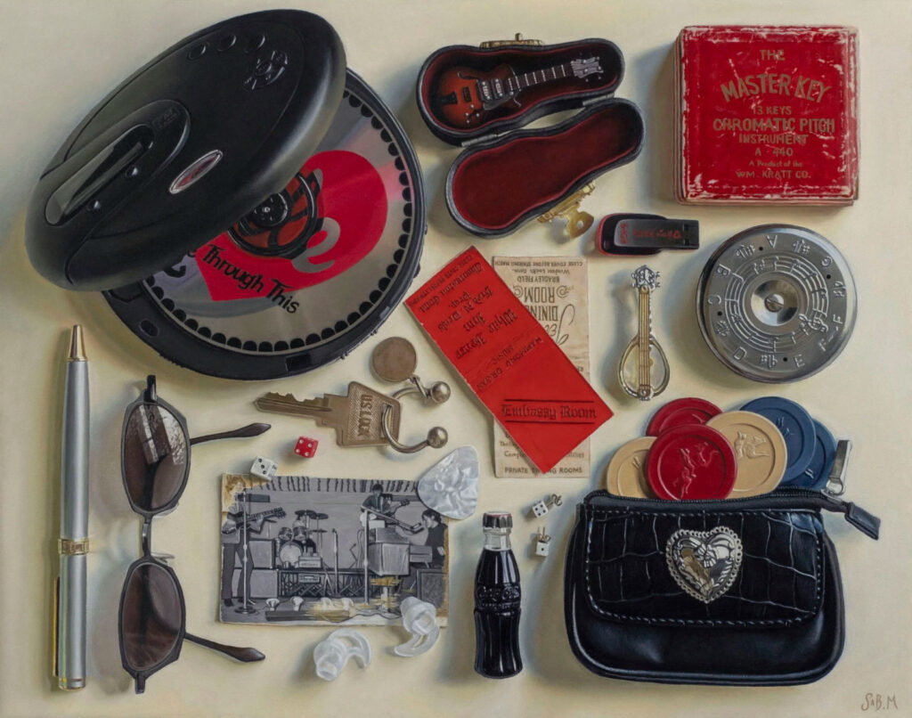
Embassy Room, oil on canvas, 2025, by Sabrina Montella • @sabrinamontella.art

Lucky Charms, oil on canvas, 2023, by Sabrina Montella • @sabrinamontella.art

Venus, oil on canvas, 2023, by Sabrina Montella • @sabrinamontella.art
Anthony Mastromatteo • @ammastromatteo
Richard Bagguley
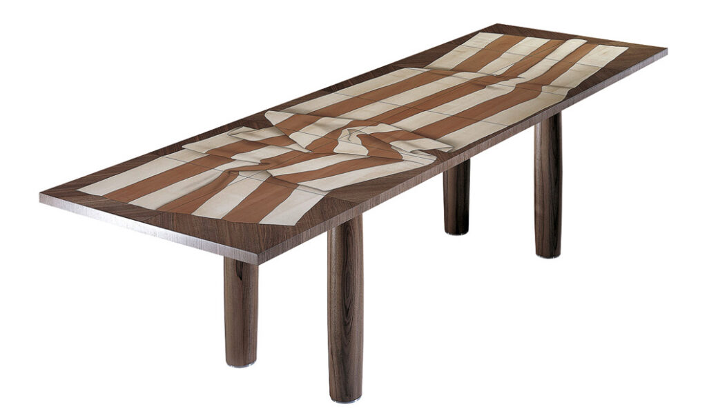
Arkadien, Dining table 90 x 270 x 72 cm, Veneered Wood (pear, maple and American walnut),
wooden legs covered with American walnut. Artists: Trix & Robert Haussmann, 1994
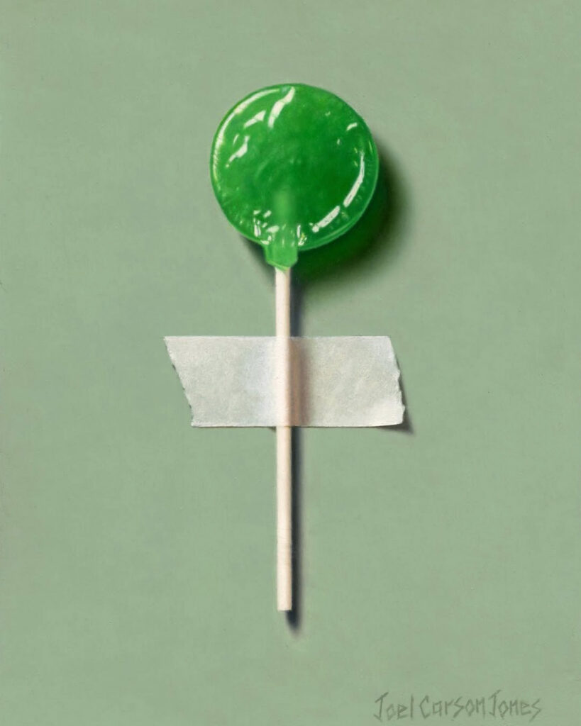
Vintage Pop 4, Oil on Panel, 2023 • by Joel Carson Jones @joelcjonesart
Have you come across a trompe l’oeil book cover (or a contemporary artist working in this vein) that we’ve missed?
Can you help supply missing credit information for any of the work featured above?
We’d love to hear from you to keep the conversation going! Write us here.
And follow INABC on Instagram so you don’t miss future Design Device collections like this!